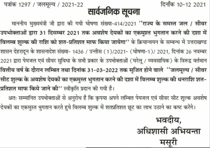
मुख्यमंत्री द्वारा की गई घोषणा “उत्तराखंड राज्य के समस्त जलमूल्य एवं सीवर उपभोक्ताओं द्वारा अवशेष देयको का एकमुश्त भुगतान करने की दशा में विलंब शुल्क में 100% छूट दी जाएगी।”
अधिशासी अभियंता जल संस्थान मसूरी ने जानकारी देते हुए बताया कि
इस संबंध में प्राप्त शासनादेश के अनुसार अगर 31 मार्च 2022 तक जल एवं सीवर के (घरेलू एवं व्यवसायिक) अवशेष देयकों (bill) का एकमुश्त भुगतान किए जाने की दशा में विलंब शुल्क में शत प्रतिशत (100 %) छूट मिलेगी। कृपया इस छूट का लाभ उठाएं और अपने अवशेष जलमूल्य एवं सीवर सीट का भुगतान अविलंब करना सुनिश्चित करें।

I’m extremely inspired with your writing talents as smartly as with the format on your weblog. Is this a paid theme or did you modify it yourself? Either way stay up the nice high quality writing, it’s rare to see a nice blog like this one today!
Explore the ranked best online casinos of 2025. Compare bonuses, game selections, and trustworthiness of top platforms for secure and rewarding gameplaycasino slot machine.
Nội dung rõ ràng và dễ hiểu, mình học được nhiều điều.
Die hellen Lichter, die anregende Musik und
die freundlichen Mitarbeiter sorgen dafür, dass sich die Gäste sofort willkommen und wohl
fühlen. Das Fun House Casino bietet eine beeindruckende Auswahl an Spielen, die für jeden Spieler etwas zu bieten haben.
Mit einem breiten Angebot an Spielen und Unterhaltungsmöglichkeiten bietet das Casino eine erstklassige Atmosphäre, die Besucher aus der ganzen Welt anzieht.
Das Fun House Casino ist einer der beliebtesten Spielorte für Glücksspiel-Enthusiasten.
Gewinne Preise fr jedes Zimmer, das du fertigstellst, und kmpfe um den groen am Ende!
Haben wir erwhnt, dass House of Fun Online-Casino-Slot-Automaten KOSTENLOS gespielt werden knnen?
Sie sollten sich vor dem Monster verstecken, das Spieler treffen können, indem
sie dieses Spiel spielen. Hier ist Luckyboygamblers und ich möchte euch
heute meine Bewertung des Spielautomatenspiels „House of Fun“ von Betsoft auf casinospot.de vorstellen. Neue und bestehende Spieler werden im House Of Fun Slots
Casino regelmäßig mit großzügigen Aktionen, Freispielen und exklusiven Promotionen verwöhnt.
Mit Fun Casino Mobil können Spieler, die gerne unterwegs spielen, über einen mobilen Browser
auf die mobile Version der Seite zugreifen. Wenn
Sie einen Spielautomaten, Blackjack oder Roulette-Test in der Fun Casino-Bibliothek durchführen, werden Sie überrascht sein, wie viele Spiele Sie spielen können.
References:
https://online-spielhallen.de/1go-casino-bewertung-eine-umfassende-analyse/
When the ancient Greeks adopted the alphabet, they had no use for
a letter representing a glottal stop—so they adapted the sign to
represent the vowel /a/, calling the letter by the similar name alpha.
The earliest known ancestor of A is aleph—the first letter of the Phoenician alphabet—where it represented a glottal
stop [ʔ], as Phoenician only used consonantal letters.
A, or a, is the first letter and the first vowel letter of the
Latin alphabet, used in the modern English alphabet,
and others worldwide. Before a consonant sound represented by
a vowel letter a is usual In the Phoenician alphabet the letter stood for a species of breathing, as vowels were not represented in the Semitic alphabets.
For more information, see the developer’s privacy policy .
Fixed bugs, improved performance, drank way too much coffee.
You can also track contractual issues, performance, and activities.
The system will provide you with a unique secrete key or keys to participate in the procurement process.
References:
https://blackcoin.co/betonred-online-casino-a-bold-new-place-to-play/
casinos online paypal
References:
https://jobe.pk/companies/beste-online-casinos-mit-paypal-einzahlung-2025/
online casino for us players paypal
References:
innovationsgroup.in
online betting with paypal winnersbet
References:
https://suryapowereng.in/employer/top-pokies-2025-ranked/
paypal casinos for usa players
References:
f18limited.com
разработка интерьера дизайн студии интерьера спб
заказать дизайн интерьера загородного дома заказать дизайн проект интерьера загородного дома
The best porn generator ai porn chat your fantasies remain strictly between you and the neural network. Instant, high-quality generation, extensive scenario and character customization. Available 24/7. For adults.
Больше на нашем сайте: https://hackernoon.com/preview/6923eee85d67a9e1e858f98c
Обновлено сегодня: https://remontparketspb.su
Подробности по ссылке: https://dom-cao.ru
студия дизайна интерьера в спб дизайн квартиры для ремонта
заказать дизайн комнаты услуги по разработке дизайна
циклевка паркета под ключ https://tsiklevka-parketa.ru
Старый паркет? шлифовка паркета в спб профессиональное восстановление деревянного пола без пыли и лишних затрат. Удаляем царапины, потемнения и старое покрытие, возвращаем гладкость и естественный цвет. Используем современное оборудование, выполняем циклевку, шлифовку и лакировку паркета под ключ с гарантией качества и точным соблюдением сроков.
Details on the page: http://www.himlammaca.com/tips-twist-in-the-a-great-saree-to-the-greatest-photoshoot/
What’s Changed: https://vinoxeviye.com/top-casinos-online-legais-acimade-portugal/
Full Version at the Link: https://routinehub.co/user/XXXBP.TV
Today’s Top Stories: https://microscan.co.ke/?p=404402
Dive Deeper: https://tawk.to/6f914d8c0bd9bf7816c46cedae31582d52e17778?_gl=1*14gos91*_ga*MTc1ODAxNDAwNC4xNzczNzc3NjAz*_ga_ZJL9LF36Z8*czE3NzM3Nzc2MDIkbzEkZzEkdDE3NzM3Nzc2MTQkajQ4JGwwJGgw
Selected articles: https://hasay.com/melhores-casinos-online-sobre-portugal-dezembro-de-2025/
Top Stories: https://www.dayijixie.com/news/7494/
Дополнительная информация: шлифовка паркета цена
Все подробности по ссылке: циклевка паркета под ключ цена
Volvo спецтехніка https://spectehnika-volvo.mystrikingly.com/ екскаватори, фронтальні навантажувачі та дорожні машини. Надійність, ефективність і сучасні рішення для будівництва. Продаж, підбір і обслуговування техніки для бізнесу.
Stackshine http://www.en.stackshine.io a SaaS cost management platform: subscription control, usage transparency, renewal tracking, and employee offboarding. Optimize your budget and reduce unnecessary software costs.
услуги ответственного хранения ответственное хранение товаров цены
дизайнер квартир недорого дизайн проект интерьера
Лучшее путешествие джип драйв тур горы, каньоны и побережье. Увлекательные маршруты, опытные гиды и яркие впечатления от путешествий по Крыму.
Do you trade cryptocurrencies? bitkelttrade passive earnings automate your transactions and earn passive income. Smart algorithms analyze the market and help you make decisions. Increase your income and reduce risks with modern technology.
флаг по индивидуальному заказу изготовление флагов с логотипом на заказ
Хочешь оригинальную подушку? аниме подушки дакимакуры комфорт и уют для сна. Длинная форма, мягкий наполнитель и стильные принты. Отлично подходит для отдыха и расслабления.
Нужен пластический хирург? сайт клиника пластической хирургии санкт петербург современные операции и эстетические процедуры. Опытные хирурги, безопасные методики и индивидуальный подход. Консультации, диагностика и качественный результат.
Нужна мебель? https://mebel-dub-zakaz.ru эксклюзивные изделия из натурального дерева. Индивидуальный дизайн, качественные материалы и точное изготовление. Решения для дома и бизнеса.
Нужна премиум мебель? мебель из массива изготовление на заказ. Натуральные материалы, эксклюзивный дизайн и долговечность. Решения для дома и бизнеса с высоким уровнем качества.
мебель из массива https://mebel-dub-zakaz.ru
Текущие рекомендации: https://trafficforsimilarweb.com
Раскройте потенциал структуры email письма повышающей CTR и продажи через систематизированный подход к организации текста, заголовков и визуальных элементов. Многие маркетологи упускают, что композиция письма влияет на поведение читателя ещё до прочтения основного контента, определяя, будет ли он вообще заинтересован в предложении. В статье детально разбираются компоненты высококонвертирующих писем: оптимальная длина subject-строки, расположение CTA-кнопок, использование белого пространства и порядок представления информации. Контент предназначен для email-специалистов, маркетинг-директоров и владельцев интернет-магазинов, которые хотят масштабировать выручку через собственный лист подписчиков. После внедрения описанных принципов вы заметите увеличение кликабельности и снижение процента отписок в течение первых двух недель кампаний.
Пошаговая схема запуска YouTube кампаний без блокировок предоставляет медиабайерам детальный чеклист предварительной подготовки и технических настроек для безопасного старта. YouTube остаётся одной из самых прибыльных площадок для арбитража, но требует соблюдения строгих требований Google и осторожного подхода к выбору креативов. В статье разобраны критерии отбора видеоматериалов, правила оформления описаний объявлений и техники скрытия истинной цели кампании в соответствии с политикой платформы. Автор показывает, как правильно настроить конверсион-трекинг и связать события YouTube с целевыми действиями в целевом сервисе. Решение будет полезно как начинающим арбитражникам, так и опытным медиабайерам, ищущим новые способы масштабирования без потерь бюджета. Следуя представленному алгоритму, вы сможете запустить первую кампанию за несколько часов и начать собирать данные для оптимизации.
While reviewing multiple ecommerce UI mockups for usability testing and consistency I navigated a category interface containing a href=”//ambercoastmarketplace.shop/](https://ambercoastmarketplace.shop/)” />Amber Shop Coast Marketplace Studio inside a sidebar module, – everything loads quickly and looks tidy which makes browsing feel simple and well structured without confusion or unnecessary complexity
During a casual browse through construction design sites and stonework showcases, I encountered stone artistry link – The work looks solid and well executed, and the imagery captures the fine craftsmanship behind each installation perfectly.
As I continued going through various purpose focused websites, I encountered something within the text see more here and it contains nicely organized content that is purpose driven and easy to explore overall
I didn’t expect much while browsing randomly, but something appeared that caught my attention, check personal blog, and the platform offers relatable content that feels simple, warm, and easy to connect with overall
During my exploration of fast loading web tools, I encountered check hiperfree smooth hub – The platform features a clean interface with fast loading performance and smooth functionality that enhances usability significantly.
mitchwantssununu.com – Interesting concept site, content feels direct and somewhat thought provoking today
During my review of different event platforms, I found view winter details – The presentation feels modern and useful, allowing visitors to quickly grasp information while enjoying a pleasant and easy browsing experience.
While comparing e-commerce platforms designed for usability and flow, a standout example is Glade Frost Experience Vault which maintains feels structured and simple, making it easy to explore content, ensuring a calm and intuitive browsing environment across all sections.
People who enjoy rustic themed digital marketplaces often explore platforms like Cove Wheat Meadow Outpost where browsing feels smooth and naturally structured – The layout ensures ease of use and visual comfort, allowing users to explore products without stress or unnecessary complexity in design.
People who appreciate organized online marketplaces often browse platforms like Cove District Sun Goods Center where items are presented in a bright and structured layout – The design makes browsing feel smooth and enjoyable, allowing users to explore products easily without distraction or unnecessary complexity.
While browsing detailed Hawaiian accommodation listings, I discovered a boutique property page with strong presentation quality online and recently viewed < big island inn profile – The information is clear and inviting, offering a well balanced overview of comfort, scenery, and guest experience overall feel
People exploring boutique inspired online stores often enjoy environments where aesthetics and usability work together to create a calm and engaging browsing experience gildedcove boutique emporium – The layout emphasizes refined structure and visual harmony, allowing users to browse comfortably while products remain clearly highlighted throughout the experience.
While searching through online reflective writing spaces I found a simple site that shares direct commentary and thoughts using honest viewpoint blog – the content feels raw and unfiltered providing a sense of personal interpretation on ongoing societal and political conversations
While reviewing digital storefront platforms emphasizing usability and structure, a strong example is Gilded Brook Unified District where nice visual balance and navigation works without any confusion, making navigation feel consistent, intuitive, and easy for all users.
During my exploration of seasonal celebration pages, I encountered see festival info – The site provides a refreshing browsing experience with content that feels relevant, helpful, and well organized for easy understanding and navigation.
Users who prefer clean digital shopping experiences often engage with sites such as Kettle Harbor Commerce Select Hub where products are displayed in a minimal layout – The interface makes browsing feel simple, structured, and easy to manage throughout the platform.
People who enjoy well designed online goods districts often engage with platforms like Cove Sun District Goods Market where items are displayed in a structured and friendly layout – The browsing experience feels smooth and pleasant, with clear organization that helps users move through categories easily and comfortably.
Shoppers who value simple ecommerce design often appreciate vault layouts that reduce complexity while maintaining strong visual structure and consistency Harbor Glass Vault Showcase – The design is minimal and refined, making browsing easy while ensuring products remain clearly visible and logically organized throughout the experience.
modelscanvas.com – Creative portfolio vibe, visuals and layout feel clean and professional design
People who enjoy curated creative stores often browse platforms such as Wave Trail Craft Market where items are displayed with strong attention to aesthetic detail and structure – The interface feels organized and visually engaging, helping users appreciate handcrafted products while navigating categories easily and efficiently.
While browsing innovative retail platforms online, I discovered a concept supermarket site that relies on simplicity to deliver its message clearly digital hope food market – The layout is minimal and effective, making it easy to navigate and understand the core idea presented
Across various online retail usability evaluations, a strong example is Night Glade Experience House where everything feels straightforward and browsing is comfortable and stable, allowing users to browse comfortably through well organized and visually balanced pages.
During my content review process, I found view more details – The information is presented clearly and concisely, helping readers understand the purpose and services without unnecessary complexity.
Users who enjoy creative storefront experiences often engage with sites such as Teal Vendor Artisan Cove Atelier Hub where products are displayed in an artistic and clean format – The layout creates a structured browsing experience that feels engaging, balanced, and visually appealing.
Users who prefer structured vendor ecosystems often explore sites such as Apricot Vendor Meadow Works Market where content is displayed in accessible layouts – The interface ensures browsing feels smooth, intuitive, and well arranged for easy discovery.
While browsing creative portfolio platforms that showcase visual work and artistic presentation I came across a site featuring modern portfolio gallery – the overall layout feels polished and thoughtfully arranged with clean visuals that give a professional and refined impression throughout the browsing experience
Users looking for intuitive navigation systems in online stores often appreciate platforms that prioritize clarity, especially when using websites like Berry Cove Navigation Shop where menus and categories are designed to guide visitors naturally through the shopping journey without confusion – The navigation-first approach ensures every section is accessible and logically arranged for user convenience
While exploring global winery websites, I encountered a structured and elegant brand platform that showcases detailed wine information clearly canadian vineyard showcase page – The presentation feels refined and attractive, giving users an easy and engaging way to explore the wines
When reviewing e-commerce systems focused on usability, a notable example is Harbor Sage Vendor Hub Vault which delivers clean design and content is arranged in a logical order, ensuring a calm and distraction free browsing experience for users.
As I examined several conservation platforms, I came across discover more here – The content is carefully organized and presented in a way that shows clear effort and dedication to communicating the cause effectively.
Users who prefer structured ecommerce systems often explore sites such as Teal Commerce Harbor Market Hub where products are grouped in a simple and efficient layout – The interface creates a seamless browsing experience that feels organized, fast, and easy to navigate across all sections of the platform.
Shoppers who prefer minimal ecommerce aesthetics often value clean collective layouts that reduce clutter and highlight products in an organized and visually appealing way Glade Collective Ridge Store – The design feels modern and well structured, offering a browsing experience that is simple, clear, and visually consistent throughout the platform.
I didn’t expect much while browsing randomly, but something appeared that caught my attention, check support page, and the platform shows a charity focused mission with clear community assistance and positive outreach overall
While searching for retro inspired digital spaces I discovered a unique themed site that highlights nostalgic elements through vintage themed park page – the design feels immersive and visually engaging making it enjoyable to explore different sections at a relaxed pace
While exploring experimental online design concepts, I found a platform that stands out through its unconventional and creative structural layout digital abstract structure hub – The content feels thoughtfully experimental, with a layout that encourages exploration and highlights creative presentation techniques
People who enjoy handcrafted product platforms often explore sites like Opal Artisan Design House where items are presented with strong focus on originality and texture – The structure supports an authentic browsing experience that showcases craftsmanship clearly while maintaining a visually balanced and easy to navigate interface.
Across multiple e-commerce usability evaluations emphasizing simplicity, a strong example is Amber Summit Commerce Marketplace where smooth experience overall, pages feel fast and easy to use, making browsing efficient, intuitive, and pleasant across the entire platform.
In the middle of exploring music fan websites, I discovered this live music page – The interface is simple and practical, making browsing smooth and allowing users to find information easily.
Users who prefer well organized ecommerce hubs often explore sites such as Trail Harbor Commerce Easy Hub where products are presented in a minimal and clean format – The design makes browsing feel intuitive, smooth, and easy to manage across all sections of the store.
Users exploring premium ecommerce emporiums often notice how structured visual layouts improve clarity and help highlight product details in a more refined browsing environment Glass Harbor Emporium Hub – The polished emporium design presents items in a clean and elegant structure, making browsing smooth, visually organized, and easy to navigate throughout the entire experience.
nomeansnoshow.com – Strong identity here, site feels bold and creatively expressive throughout pages
While researching modern biography and portfolio websites, I found a clean and minimal profile page with excellent usability and structure jackonson professional identity site – The content is clearly arranged, and navigation is smooth, making the browsing experience simple and effective overall
Across various e-commerce experience evaluations focused on usability, a notable example is Icicle Lakefront Network Mart where simple layout and information is easy to find at a glance, helping users interact with a clean, efficient, and easily navigable interface.
During research into soft aesthetic marketplace websites, I explored browse this willow market hub – The design feels gentle and polished, and navigation is smooth with a relaxing and visually cohesive experience.
People who prefer ocean inspired digital stores often explore sites like Harbor Wave Seaside Commerce Outpost where items are arranged in a calm and clean layout – The interface creates a pleasant browsing flow that feels easy, relaxing, and visually balanced throughout the shopping experience.
People who appreciate clean digital storefronts often prioritize platforms that reduce clutter and improve browsing flow such as Golden Caramel Supplies where warm tones clean structure make product exploration simple enjoyable experience flow – The layout encourages effortless browsing with minimal distractions and a consistent visual language throughout
During my search for well-structured event platforms, I noticed check this event site – The presentation is clean and organized, and the content feels genuinely engaging while maintaining a consistent quality across all sections of the website.
Users exploring curated shopping platforms often appreciate emporium systems that focus on visual consistency and smooth navigation across all categories Glass Stone Emporium Line – The design is modern and cohesive, ensuring browsing feels organized, visually consistent, and easy to understand at every step.
While comparing digital commerce hub interfaces, I discovered browse this linen commerce space – The design feels clean and functional, and navigation is smooth, making browsing easy and enjoyable throughout the experience.
While exploring unique digital art spaces I found a platform that embraces bold expression and strong visuals using visual identity hub – the layout feels compelling and keeps users engaged through its creative and unconventional presentation style
Across usability studies of digital marketplaces, a notable example is Upland Orchard Market Hub where well structured pages and browsing feels natural and efficient, helping users explore categories with ease and without visual clutter.
While browsing themed digital platforms, I came across a site that blends cultural storytelling with modern design in a very engaging way global urban culture page – The website feels diverse and interesting, combining multiple influences into a visually appealing and thoughtfully structured experience
People who appreciate handmade digital marketplaces often browse platforms like Cove Artisan Wind Craft Market Hub where items are displayed in a structured and minimal layout – The design creates a pleasant browsing experience that feels clean, organized, and easy to navigate while exploring handcrafted goods.
Users drawn to premium ecommerce environments often expect refined layouts that resemble curated gallery house experiences Premium Cove Galleria House – This structure ensures that every product is presented with clarity and purpose supported by elegant design choices and consistent visual hierarchy that improves readability encourages browsing and helps users quickly identify relevant items without unnecessary distraction or clutter overall experience
While browsing through different credibility-based websites, I stumbled upon this trusted resource – The information feels dependable and well organized, providing valuable insights that are easy to follow and understand.
oakmeadowcommercehub – Commerce hub feels organized, categories are clear and easy browsing
nutschassociates.com – Professional services look solid, information is clear and easy to follow
As I compared different retail atelier platforms for usability and seasonal appeal, I came across explore mint orchard retail space – I will definitely revisit here for the holiday season because browsing feels easy and the structure is clear and inviting.
Online visitors interested in creative goods frequently prioritize platforms that blend design and usability and while navigating different shops they may encounter harbor violet craft market offering diverse artisan selections and smooth category transitions for improved shopping comfort – This marketplace provides an engaging experience centered on handcrafted quality and intuitive browsing structure.
While reviewing digital storefront platforms emphasizing usability and structure, a strong example is Frost Lakefront Unified Vault where clean interface and everything is easy to navigate without effort, making navigation feel consistent, intuitive, and easy for all users.
Users who appreciate functional ecommerce outlets often explore platforms such as Harbor Stone Organized Outlet Hub where products are grouped logically for fast browsing – The interface ensures a clean shopping experience that feels simple, structured, and easy to navigate across all product categories.
Users who appreciate minimal soft tone galleries often browse sites such as Stone Dawn Galleria Harmony where items are presented in a clean layout – The interface ensures browsing feels balanced, soothing, and visually comfortable throughout the entire experience.
While researching multicultural inspired online platforms, I discovered a website that mixes urban and global cultural elements in a smooth presentation cultural mix showcase page – The site feels interesting and diverse, offering an engaging combination of styles that enhances visual appeal throughout
uplandcovevendorcorner – Vendor corner feels helpful easy browsing and clean layout overall
While analyzing health coaching websites, I discovered open this paleo guide page – The interface feels very neat, and the reading experience is smooth, allowing users to focus comfortably on the information provided.
While browsing professional company websites I came across a platform that focuses on clean design and structured navigation featuring business structure platform – the layout feels consistent and supports a smooth and efficient browsing experience overall
People who enjoy socially driven marketplaces often explore platforms like Harbor Pine Collective Bazaar Hub where trading activity is shared among multiple sellers – The design highlights a vibrant and dynamic structure that encourages exploration and reflects an engaged community commerce environment.
While analyzing modern online shopping platforms built for usability, a notable example is Frost Forest Trade Vault where the design feels balanced and content is clearly organized, helping users browse smoothly without unnecessary clutter or confusion.
Users who prefer icy minimalist ecommerce platforms often explore sites such as Icicle Market Clear Isle Hub where items are displayed with cool toned simplicity and structure – The design ensures a refreshing browsing experience that feels clean, easy to navigate, and visually consistent across all product categories.
While browsing unusual sports themed websites recently I came across a surprisingly lighthearted page that immediately stood out because it mixes fandom energy with playful presentation and casual commentary that feels oddly entertaining for visitors exploring niche topics online today volleyball fan hub josh edits – The site feels fun and unexpectedly engaging, with a playful tone that keeps the content easy to read and lightly entertaining throughout overall today
During my exploration of different websites, I found open this snapshot site – I stumbled upon it randomly, but it actually looks useful overall, with content that feels straightforward and engaging to view.
pair-dating.com – Dating concept looks simple, interface feels straightforward and user friendly experience
Users exploring friendly ecommerce layouts often appreciate stores such as Cove Soft Market Hub which combines gentle visual styling with practical organization – The interface allows users to browse comfortably while maintaining a strong sense of structure and clarity across all categories
People who enjoy straightforward online shopping often browse platforms like Stone Outpost Minimal Glade Hub where design is kept simple and efficient – The interface ensures users can navigate easily while maintaining a clean and functional browsing environment that avoids unnecessary visual noise.
As I reviewed multiple travel photography platforms, I noticed check this travel image page – The browsing experience feels excellent, with fast loading pages and a structure that is simple and intuitive to navigate.
While checking out modern dating interfaces to understand design trends I noticed a platform built around simple match portal – the presentation feels uncluttered and the navigation works smoothly making the overall browsing experience efficient and comfortable
While checking out regional real estate resources I found a site that presents housing listings in a clean and functional format county realty search board – It delivers a simple browsing experience where users can easily filter and view available properties without unnecessary complexity or confusion
People who appreciate countryside styled digital stores often browse platforms like Outpost Timber Trail Rustic Hub where items are arranged in a structured and earthy design – The layout creates a smooth browsing experience that feels natural, balanced, and comfortable across all sections of the store.
Users who prefer calm and minimal shopping experiences often engage positively with Ginger Vault Direct Shop which focuses on straightforward navigation and structured product listings – The interface feels secure and thoughtfully designed to support easy browsing decisions.
piercethearrow.com – Bold branding here, content feels energetic and visually striking creative site
In the process of looking at artisan product sites, I came across explore this accessory site – The balance between design and content is noticeable, making the website feel both attractive and easy to use.
While reviewing family focused film platforms I came across a site that emphasizes safe content selection and presents movies in a very organized and accessible format child friendly film listings – It offers a smooth browsing experience that helps parents and users find suitable entertainment without confusion
People who appreciate curated online shopping environments often explore platforms like Stone Golden Collective Vision Hub where items are displayed in a refined and elegant format – The interface enhances product appeal through clean organization and premium styling, creating a smooth and visually engaging browsing journey.
While exploring online stores with soothing design styles I discovered a platform showcasing calm retail outpost – the overall aesthetic uses soft tones and the interface feels relaxed, making it easy for users to navigate through content without stress
While reviewing creative content platforms I noticed a website highlighting distinctive art showcase – the branding feels powerful and the visual presentation creates an engaging and memorable browsing experience for visitors
In the process of reviewing multiple structured websites, I found explore this rtc site – The organization of content stands out, helping users easily locate important information without feeling overwhelmed or lost in disordered sections.
While browsing creative food design websites I found a platform that focuses on sweet themed branding and presents its content in a structured visually appealing format that is easy to navigate and pleasant to explore sweet themed design gallery – The presentation feels smooth and cohesive, offering an engaging and visually balanced experience overall
People who appreciate cozy ecommerce experiences often engage with sites like Trail Harbor Artisan Glow House where products are displayed in a soft and welcoming style – The interface focuses on warmth and simplicity, making browsing feel relaxed, enjoyable, and visually engaging throughout the store.
While researching structured online commerce systems and their user experience, I explored browse this meadow linen hub – The layout is clean and efficient, and browsing feels smooth, making the entire experience easy and enjoyable from start to finish.
Online craft enthusiasts often browse diverse digital stores seeking inspiration and quality handmade items while occasionally discovering platforms such as violet harbor artisan gateway offering a wide selection of creative goods and unique browsing categories for relaxed shopping sessions – The marketplace emphasizes smooth navigation and a pleasant user experience focused on handcrafted variety.
People who enjoy aesthetically soft ecommerce galleries often engage with platforms like Galleria Dawnstone View where items are displayed in a gentle and minimal layout – The design creates a calm browsing atmosphere that feels visually light, balanced, and easy to navigate without distraction.
preventcovid19trial-uk.com – Informational tone here, content feels research focused and medically structured layout
In structured UX benchmarking of commerce platforms, a strong example is Harbor Violet Experience House where clean structure overall, makes browsing feel smooth and simple, giving users a seamless interaction flow across categories and product listings.
While studying soft and elegant online retail experiences, I came across visit velvet willow hub – The interface feels delicate and smooth, and navigation is calm, structured, and visually pleasing throughout the site.
Users browsing online vendor hubs frequently mention that structured categories help reduce confusion, especially after opening Meadow Vendor Navigation Suite Online and they describe the interface as clean and well arranged – the system is often praised for making it easier to compare items and locate desired products quickly
Users who appreciate rural-inspired ecommerce design often find value in platforms that maintain clarity and flow, especially when browsing Meadow Path Goods Exchange where the layout is intentionally simple, helping visitors focus on products while enjoying a smooth and uninterrupted browsing experience.
While reviewing mindfulness and yoga platforms, I found browse this yoga idea site – The concept is intriguing and well presented, making it something that could be explored more thoroughly later for deeper insight.
While searching for sports injury recovery platforms I discovered a football therapy focused website that presents practical advice in a supportive and clearly organized manner aimed at helping athletes improve physical condition and recovery routines team recovery performance page – The information feels useful and grounded, offering a supportive approach to sports therapy concepts
People who enjoy functional online outlet platforms often explore platforms like Pine Harbor Outlet Flow Market where product organization is clear and practical – The interface supports smooth navigation and structured browsing, ensuring users can easily access categories without confusion or unnecessary visual clutter.
People who enjoy straightforward shopping platforms often explore sites like Harbor Kettle Goods Commerce Hub where items are arranged in a clean layout – The design ensures browsing feels clear, organized, and easy to navigate without confusion.
While reviewing digital commerce hub websites, I came across visit vale harbor marketplace hub – The platform is nice, navigation is easy, and the content appears clean and straightforward to browse.
While analyzing marketplace websites, I noticed that Harbor marketplace listings is featured in a way that enhances browsing flow – it gives users a sense of structured variety and smooth transitions between different product sections without confusion.
People exploring structured ecommerce vault systems often appreciate designs that prioritize clarity and consistent visual organization throughout browsing sessions Harbor Vault Hazel Hub – The interface delivers a smooth user journey through well organized categories and minimalistic design elements ensuring users can easily locate products while enjoying a calm and efficient browsing experience across the entire digital storefront today environment.
While reviewing health focused online resources I came across a site centered around medical research info page – the layout appears organized and the tone of the content supports a professional and informative browsing experience throughout
velvetcoveartisanoutlet – Artisan outlet design clean, products are nicely arranged and easy to explore
While checking out different artist and band pages online, I stumbled upon open this band site – The style is really appealing, and the presentation feels smooth and well structured, making it enjoyable to browse through the content.
Shoppers who value simple and welcoming ecommerce systems often browse platforms such as Bright Harbor Commerce Point – The layout supports fast discovery and easy product access, making the entire shopping experience feel smooth, efficient, and friendly while maintaining a visually uplifting and well organized interface.
While exploring online urban culture resources I found a Seattle based lifestyle platform that presents city living content in a vibrant and modern way creating an engaging experience for users interested in contemporary urban environments urban culture seattle page – The design feels fresh and energetic, with content that reflects modern city life
nightorchardretailmart.shop – Bought a gift last week, packaging felt really premium honestly.
While analyzing boutique hall websites for design quality, I checked see velvet brook retail space – I found useful information, and everything feels organized, making it easy to follow while browsing through the site.
Users who enjoy efficient ecommerce design often engage with sites such as Upland Harbor Smart Commerce Hub where products are displayed in a clear and logical format – The design focuses on usability, making browsing feel quick, smooth, and highly intuitive throughout the shopping experience.
While browsing digital craft marketplaces I came across a platform that feels well structured and highly accessible online where Walnut Cove artisan experience hub offering curated handmade items with strong visual storytelling product flow – It provides a smooth shopping experience while highlighting artisan craftsmanship and cultural value design focus
People who enjoy structured online stores often explore sites such as Cove Goods Vale Shopping District where products are arranged cleanly – The interface ensures browsing feels simple, comparison is quick, and navigation is user friendly.
While analyzing various online trading guides for readability and organization, I discovered during browsing sequence Trade Clarity Information Portal listed among similar sites – revised insight: the structure is minimal and straightforward, ensuring information remains accessible and easy to interpret.
While exploring online shopping platforms I found a shop that focuses on minimal design and clean product arrangement making it easy for visitors to browse and understand offerings quickly simple product listing store – The site feels clear and efficient
As part of reviewing fresh and minimal online vendor hall designs, I noticed check mint cove hall page – The layout feels simple and clean, and navigation is intuitive with a consistent user experience.
While analyzing digital marketplace interfaces, I noticed how Vendor hall Harbor Birch catalog space appears within the central page content – The platform presents diverse listings and provides a smooth user experience with intuitive layout design that simplifies browsing and improves overall engagement for visitors.
As I went through several informative pages, I came across discover more – The overall approach is clear and concise, helping readers grasp the core ideas quickly while maintaining a polished and professional appearance.
During a final comparison of commerce hub websites, I found see velvet grove commerce hub collection – The site offers great options, and I enjoy checking listings regularly since the overall experience is organized, smooth, and easy to browse.
Online retail platforms that emphasize structured navigation and user-friendly design are often preferred by shoppers who value efficiency, especially when accessing systems like Coastal Commerce Bridge which provides a streamlined shopping environment where users can move between categories effortlessly, benefiting from a consistent layout and clearly defined browsing pathways throughout the site.
Users who appreciate stylish marketplace design often find platforms such as Harbor Trail Vendor Showcase where each item is presented in a visually appealing studio inspired layout – The design emphasizes creativity and structured presentation, making product browsing feel engaging, polished, and visually consistent across categories.
Users who appreciate modern vault ecommerce design often browse platforms such as Ivory Vault Ridge Elite Hub where items are shown in a clean and structured layout – The design creates a premium browsing experience that feels curated, minimal, and easy to navigate from start to finish.
Users who appreciate curated digital ecosystems often engage with sites such as Teal Harbor Collective Unity Hub where products are displayed in a clean format – The interface makes browsing feel structured, curated, and visually consistent across all sections.
While searching for community information platforms I found a Lochwinnoch website that shares local updates and guidance in a friendly tone making it feel accessible and supportive for anyone interested in the area or its services neighborhood info welcome page – The site feels inviting and well structured, focused on community support
As I evaluated several online marketplaces for outdoor and hiking products, I paid attention to navigation structure and usability, and in the middle of that review I came across Harbor Trail Market among comparable sites – updated observation: the interface remains simple and responsive, contributing to a smooth, well organized, and user friendly experience.
uplandharborcraftmarketplace.shop – Navigation could improve but products are unique and cool.
While browsing vendor marketplaces I came across a site that displays products in organized categories allowing users to browse efficiently and understand available listings without confusion clean ecommerce vendor hub – The site feels easy to use
During research into structured trade platforms, I explored browse this raven commerce house – The design is practical and clear, and information is arranged in an easy-to-read and logical format.
While reviewing digital commerce platforms and browsing systems, I came across visit violet harbor retail marketplace – The layout is impressive, and it makes product browsing feel quick, smooth, and very convenient overall.
While studying ecommerce platforms focused on vendor presentation and usability, I noticed Harbor Birch vendor suite – the design offers intuitive browsing tools and structured listings that make it easy for users to explore available products without confusion.
As I explored different platforms to evaluate their usefulness, I encountered learn more here – The content is arranged in a logical flow, making it easy for users to absorb important points quickly while maintaining a clean and professional visual appearance throughout.
Shoppers who prefer organized digital marketplaces frequently look for platforms with simple browsing flows, and during exploration they might discover plum cove shopping lane featuring a diverse range of products across categories – A well designed online store that focuses on accessibility, affordability, and smooth user interaction.
Users exploring calm and visually soft ecommerce platforms often appreciate the gentle structure when visiting sites such as Lantern Meadow Commerce Hub where products are arranged in a clean and airy layout that supports easy browsing flow and readability – The soft design theme creates a smooth navigation experience, making the entire browsing journey feel relaxed, user friendly, and easy to understand across all sections.
Users who appreciate warm and cozy ecommerce design often browse platforms such as Cove Honey Vault Relax Hub where items are displayed in a soft and inviting structure – The interface makes browsing feel smooth, pleasant, and easy to navigate while maintaining a visually balanced shopping experience.
Users who value efficient financial platforms often browse sites such as Wave Harbor Trading Flow where information is structured for immediate readability – The design prioritizes clarity and speed, allowing users to quickly process updates while maintaining a smooth and active browsing experience.
While browsing alternative rock fan sites I came across a Manic Street Preachers themed page that showcases nostalgic music content in a structured format making it easy for users to revisit the band’s creative journey and history rock band memory archive – The presentation feels organized and nostalgic, with clear music references
During evaluation of various outdoor themed e-commerce interfaces, I observed how different platforms prioritize simplicity and speed in presenting their product catalogs BayCoveOutpost – updated commentary: the browsing experience feels efficient, with well structured sections that reduce effort needed to locate items.
While browsing digital shopping environments I came across a platform highlighting marketplace interface page – the design feels clean and the browsing experience remains focused on products with clear navigation paths
While reviewing design inspiration from culturally inspired marketplaces online, I checked see artisan marketplace – The interface feels colorful and rich, and browsing delivers an engaging and visually captivating experience.
During a review of modern craft marketplace websites, I found browse upland harbor craft product hub – Navigation could improve, but products are unique and cool, which makes the platform enjoyable to browse.
User experience research in online commerce often highlights the importance of clean interfaces and structured navigation particularly when assessing platforms such as Modern Retail Moon Space which is frequently referenced as a conceptual design environment that integrates visual appeal with functional usability – the result is a smoother and more engaging browsing journey for users.
While reviewing a variety of informational sources, I found check this out – The content appears thoughtfully arranged, helping readers understand the material clearly without having to work through confusing or cluttered sections.
During browsing of online retail ecosystems and curated vendor spaces, I discovered Vendor room display portal – it features organized product sections and a clean layout that helps users navigate efficiently while maintaining a pleasant visual browsing environment.
Users who enjoy structured trade ecosystems often explore sites such as Frost River Trade Core House Hub where products are arranged in a minimal layout – The interface ensures browsing feels simple, organized, and easy to explore across all sections of the marketplace.
Users who value elegant marketplace presentation often browse platforms such as Gilded Collective Stone Showcase where products are organized in a visually refined layout – The branding style enhances clarity and sophistication, making browsing feel premium, structured, and enjoyable across all categories of the store.
While exploring online marketplaces that focus on organization I came across a platform highlighting product variety showcase – the design feels neat and the browsing experience keeps everything easy to navigate and visually clear
During a review of structured and seasonal eCommerce layouts, I found browse autumn goods here – The design is warm and engaging, and moving through categories feels smooth and intuitive.
While searching cultural concept websites I found a platform that organizes informational content around modern ideas and cultural relevance making it useful for users who enjoy exploring structured and meaningful topics online digital ideas culture hub – The content feels relevant and easy to understand
As I reviewed vendor studio websites for performance quality, I noticed check walnut cove creative vendor hub – The experience has been great, and everything loads quickly and works without issues during browsing sessions.
While exploring several informational outdoor supply sites, I focused on how clearly each one communicates product details and supports quick decision making for users RidgeCoveTrading – updated observation: the presentation style is straightforward, making it easier to absorb information and navigate smoothly across pages.
Outdoor enthusiasts and design-conscious buyers frequently browse specialized collections through platforms like Harbor Gear Outlet – This version emphasizes a rugged coastal identity paired with streamlined usability, offering a minimal yet highly functional approach that resonates with users who prioritize durability, practicality, and understated modern design in their daily gear selection.
Digital craft marketplaces provide an accessible way for shoppers to explore handmade items from various cultural backgrounds Creative Artisan Marketplace – helping bridge the gap between traditional craftsmanship and modern online shopping experiences for global audiences in a seamless manner.
In the process of reviewing various home care guides, I found click for guidance – The writing style is simple and direct, making it easy for readers to absorb the key points and apply them without needing additional clarification.
valeharborcraftemporium.shop – Site works well on phone, checkout was smooth today.
While analyzing curated ecommerce environments designed for better user engagement, I observed Birch Harbor showroom access – it presents products in an organized manner with intuitive layout choices that improve browsing efficiency and create a more enjoyable discovery experience for shoppers.
People who prefer structured yet artistic marketplaces often explore platforms like Stone Ginger Creative Gallery Hub where products are showcased in a smooth and visually balanced format – The galleria layout ensures clarity and flow, helping users navigate easily while enjoying a refined and engaging browsing experience.
During a comparison of modern commerce hub platforms and their interface design, I came across discover wave harbor marketplace hub – I appreciate the effort here, and the site feels polished and user friendly while maintaining a clean browsing experience.
While checking out handcrafted style ecommerce platforms I discovered a minimalist marketplace that focuses on clarity and function featuring rustic vendor exchange – the design avoids clutter and keeps the browsing experience smooth while maintaining a consistent rustic outpost inspired identity
As I reviewed different eCommerce platforms focused on outdoor lifestyles and gear presentation, I noticed visit this outdoor hub – Its clean design approach stands out, and moving between sections feels fluid, allowing users to browse comfortably without feeling overwhelmed or lost.
While browsing travel inspiration platforms I came across a luxury lodge site that highlights premium stay experiences with polished visuals and a welcoming structure making it appealing for users interested in refined getaway options luxury nature lodge hub – The presentation feels immersive and premium throughout
While exploring different outdoor commerce information hubs, I compared usability patterns and how each site simplifies access to core product knowledge HarborUplandHub – updated commentary: the interface remains simple and effective, ensuring users can navigate content without difficulty or confusion.
Online marketplace visitors frequently prefer vendor systems that maintain clarity in listings and provide structured access to product categories in competitive online environments Moon Vendor Showcase – This design approach helps reduce confusion and supports faster decision making when browsing multiple vendor offerings platforms
While browsing commerce platforms designed with thematic consistency I discovered a website highlighting alpine product hub – the structure feels neat and the clean navigation makes it easy to explore products in a calm and organized environment
During my content review process, I found view more details – The design supports a pleasant reading experience, allowing users to absorb information without feeling overwhelmed.
As part of studying vendor atelier usability and structure, I explored check this wave harbor atelier site – Browsing here is pleasant, and categories are clear, simple, and easy to navigate throughout the experience.
Users who enjoy organized ecommerce environments often explore platforms such as Acorn Harbor Vendor Central Hall where products are grouped in a structured and easy to browse format – The interface focuses on clarity and efficiency, making the shopping experience intuitive and visually consistent throughout the site.
While comparing artisan boutique systems for handmade quality and presentation, I discovered browse velvet brook creative craft boutique – I’d recommend this to anyone who loves handmade goods since everything feels unique and carefully made.
During a detailed comparison of modern trading websites and their user interface patterns, I noticed visit this trading platform – The design is straightforward and uncluttered, allowing users to navigate content easily with a smooth and logical flow.
During an exploration of curated resource listings and niche digital hubs, I found a platform that appeared smooth and simple to use, particularly Crest goods browsing portal offering a straightforward structure for easy navigation – Came across this recently, seems quite helpful and easy to explore, with an interface that feels organized and suitable for repeated visits.
Users browsing online craft directories often value systems that make handmade products easier to discover and compare across multiple categories Handmade Market Link – this enhances user experience by simplifying navigation and improving clarity in listings for global audiences across online platforms
While studying online trade marketplaces and structured product hubs, I observed a clean interface where content sections include Canyon commerce vendor hall guide positioned mid-page, improving navigation clarity – The system supports easy browsing through well organized listings and visually consistent product categories across the platform.
Users exploring structured ecommerce goods stores often appreciate clean layouts that simplify browsing and make product discovery more intuitive across multiple categories Marble Harbor Goods Hub – The design emphasizes clarity and smooth navigation ensuring users can move through sections easily while maintaining a consistent and visually balanced shopping experience across the entire platform today without unnecessary complexity.
While exploring cruise travel information online I found a platform that highlights voyage details in a clean format making it helpful for users looking to understand cruise holiday options sea travel overview – The presentation feels organized and travel focused
Shoppers seeking organized and visually pleasing online stores often find value in platforms like Ridge Bloom Atelier which delivers a studio-inspired layout where floral products are displayed in a balanced and easy-to-navigate structure – The overall feel merges blooming ridge inspiration with atelier-style curation for enhanced shopping clarity
While analyzing online vendor atelier platforms for design quality, I checked see wave harbor artisan hub – Browsing here is pleasant, and categories are clear and easy to navigate across all sections of the platform.
During exploration of online vendor platforms on my phone, I came across a site containing Jasper trade commerce harbor hall entry – It has a cool identity, but the site lagged more than expected while loading.
While testing staging ecommerce platforms focused on organic goods and rural themed marketplaces, reviewers identified a content block featuring orchard workshop wild vendor link integrated into page flow, yet product listings lack essential ingredient information making transparency unclear – Wild orchard sounds natural and wholesome, but users cannot find any ingredient lists which reduces trust during product evaluation sessions
Users who enjoy efficient ecommerce systems often explore sites such as Chestnut Vendor Harbor Market Hall where product listings are arranged for easy navigation and fast understanding – The layout focuses on structured presentation and smooth browsing flow, making it simple for users to locate items without confusion or unnecessary visual complexity.
During a comparison of streamlined eCommerce websites, I found see autumn outpost here – The structure is clean, and navigating through the site feels easy and consistently functional.
People interested in coastal-inspired craft outlets often enjoy platforms that organize discounted handmade goods in a visually simple and easy-to-navigate structure Coastal Craft Outlet Point while ensuring reliability – this improves the shopping experience by allowing users to find affordable artisan items without unnecessary complexity or confusion.
While browsing through different curated discovery threads and online resource hubs, I came across something that felt well designed and simple to navigate, especially when seeing Harbor coast marketplace page included – everything is smooth and organized, allowing for easy exploration and comfortable revisits.
As I explored several retail mart websites for shopping experience quality, I found check night orchard gift mart – I bought a gift last week, and the packaging felt really premium, which made the whole experience more satisfying than expected.
As I reviewed a variety of support-oriented websites, I came across discover more here – The information is clearly written and thoughtfully structured, making it easy for readers to follow along.
People who enjoy modern vault-based ecommerce designs often browse sites like Vault Elm Harbor Market where products are arranged in a clean consistent format – The design ensures navigation feels secure, structured, and easy to understand at every step.
While exploring online personal pages I found a minimal style site that presents content clearly and without unnecessary detail making it feel accessible and friendly for casual users basic creative profile – The site feels very easygoing overall
While reviewing a range of vendor atelier platforms and assessing their reliability and structure, I came across explore trail harbor vendor atelier – The platform appears trustworthy, and the information provided seems accurate, well-organized, and consistent throughout the browsing experience.
During exploration of online trade portals I came across Amber Harbor commerce lounge directory – The theme looks attractive, but the lounge section is mostly blank pages, giving the impression of incomplete development.
Users who prefer clean digital shopping experiences often value platforms that prioritize clarity and structured browsing systems especially when dealing with large inventories and multiple product families organized across different sections of an online market environment for better usability Crest District Commerce Guide – The marketplace layout is designed with detailed categorization and user friendly navigation elements that allow visitors to filter and compare items efficiently, ensuring that product discovery remains fast, simple, and visually coherent throughout every stage of browsing.
Modern e-commerce ecosystems are increasingly shaped by community driven platforms that emphasize trust, collaboration, and structured vendor participation across global networks where consistency matters Mossharbor vendor network platform such systems often provide layered access controls and improved listing organization which benefits both buyers and sellers alike – Structured marketplaces like these are often viewed as more reliable due to their emphasis on governance and clarity
During exploration of various digital storefronts, I found a platform featuring Cove room Juniper goods listing page – It looks creative and modern, but the confusing structure makes it hard to understand what they’re selling.
During an exploration of clean and structured eCommerce experiences, I discovered visit gilded storefront – The design is polished, and browsing through products feels smooth and aesthetically pleasing.
While scanning through various online suggestion threads and niche directories, I noticed something that felt easy to use and well structured, especially when seeing Copper Cove access portal included – this appears to be a solid platform with clear content and simple navigation for users.
In reviewing ecommerce vendor directories I came across a structured interface where the Market hall caramel browsing center is positioned mid content, enhancing clarity – The hall feels vibrant today with attractive listings and a user friendly design that makes exploring products simple and efficient for everyday shoppers.
During a review of modern artisan marketplaces with curated selections, I found browse oak cove goods market – The variety is strong and well displayed, and the browsing experience feels engaging enough to explore slowly.
Users who appreciate clean and warm digital stores often browse sites such as Meadow Ember Trading Market where items are presented in a simple layout – The interface makes browsing feel easy, organized, and intuitive across the platform.
In the middle of evaluating online fabric marketplaces I noticed a feature block containing meadow cotton goods hall and although the visual theme is soft and pleasant, the site frequently logging users out reduces trust and interrupts what should be a smooth shopping experience overall.
oakmeadowvendorcollective.shop – Really clean product photos, descriptions are helpful too.
E-commerce growth has led to increased demand for organized vendor systems that ensure reliability and consistency in transactions particularly on platforms like Retail Commerce Hub – such systems are widely recognized for improving efficiency and providing a more predictable shopping experience for users
During my comparison of several online agencies, I encountered see more here – The overall impression is one of professionalism and clarity, with a layout that feels both modern and easy to follow.
During a detailed look at creative artisan marketplaces and their design approaches, I noticed visit this artisan trail shop – The presentation is clean and artistic, and the products feel carefully arranged, giving a pleasant and structured browsing experience throughout.
Shoppers who prioritize simple and elegant ecommerce design often appreciate platforms that reduce complexity while highlighting artisan quality when engaging with Chestnut Cove Artisan Essentials Market – the layout is intentionally minimal, allowing users to focus on products without distraction – each item is presented with clarity and purpose for a refined browsing journey.
While reviewing ecommerce vendor pages I noticed Moon Harbor trade lounge hub – The lunar-inspired layout looks polished, but missing product photos reduce confidence when trying to assess quality or product details.
While browsing through various curated marketplace directories and online resource hubs, I came across something that felt well structured and easy to follow, especially where Copper Harbor vendor portal appears – I like how simple the layout is overall, because it makes everything easier to understand quickly without unnecessary confusion.
While comparing artisan marketplace usability and design flow, I discovered browse upland cove artisan zone – The layout is clean and user friendly, and I could find everything quickly without confusion.
During ecommerce UI testing and marketplace layout reviews, analysts observed a central module containing amber ridge vendor parlor showcase node embedded within structured page flow, and although the amber ridge branding sounds warm, earthy, and appealing, the vendor parlor section clearly feels like a placeholder with minimal structure which reduces perceived completeness during usability testing across multiple devices and environments
While analyzing online vendor ecosystems I came across a clean interface that enhances browsing clarity where Harbor vendor product space Harbor vendor product space embedded within content improves structure – Vendor hall provides organized listings and smooth navigation allowing users to explore products without confusion simple clean flow.
While scanning different marketplace systems I discovered a central section containing harbor creek commerce directory hub and although the creek inspired branding is visually appealing, the search filter malfunction makes product discovery difficult and interrupts normal browsing flow significantly.
As I analyzed several outdoor retail websites, I paid attention to clarity and design balance, and during that process I found Ridge Cove Minimal Market – revised insight: the interface remains uncluttered and easy to use, making navigation feel quick, direct, and efficient for users across all sections.
Craft marketplace users often look for platforms that combine reliability, artistic variety, and efficient browsing capabilities in one place Handmade Evening Bazaar Hub supporting structured categories and smooth checkout processes for improved online shopping experience overall today – This type of platform improves both seller exposure and buyer satisfaction significantly
coworking office coworking space for rent
While studying how simplicity enhances user experience in online stores, I came across visit forest marketplace – The design feels calm and balanced, and navigation is straightforward and efficient.
pebblecreekcraftexchange.shop – Will order again next month, hope they restock soon.
While reviewing structured online marketplace designs, I came across visit this lake goods district page – The design is organized and user friendly, and navigation feels natural and easy across all categories.
During my search through online shopping deals I found Nightfall Trade House deals portal – The offers looked interesting, but I left because the checkout process didn’t seem properly secure or fully reliable.
While going through different curated directories and marketplace-style platforms, I found something that seemed clean and user-friendly, especially when seeing Coral tradehouse access link included – It’s a pretty decent site overall, with navigation that works smoothly and doesn’t create confusion, making it easy to explore different sections comfortably.
Users who appreciate well structured online stores often explore platforms such as Harbor Merchant Quick Link where navigation is optimized for fast access and clarity – The interface allows users to move quickly through sections, creating a seamless and efficient browsing experience that feels intuitive and responsive.
While reviewing staging ecommerce vendor systems and UI marketplace templates, analysts noticed a content block featuring harbor vendor marble gallery trade showcase node integrated into layout flow, and despite the marble harbor aesthetic suggesting luxury and refinement, all images are low resolution which weakens visual appeal during testing sessions and design evaluations
During exploration of various ecommerce style directories I found a mid page element featuring creek harbor marketplace trade house and although the design is consistent and clean, it feels almost identical to the tradehall version which creates confusion when trying to identify which site is which.
Modern online marketplaces benefit from intuitive structures that guide users through categorized listings while maintaining consistent usability and accessibility standards Nightfall Supply Hall – The vendor hall system presents a well ordered layout that supports efficient browsing and helps users identify relevant product categories with minimal effort
During exploration of online vendor ecosystems I found a neatly arranged marketplace that emphasizes clarity and structured browsing for users Harbor Chestnut market house directory which offers smooth navigation and a logical category layout making it easier for visitors to browse products efficiently without feeling overwhelmed by excessive information or clutter.
During a review of online retail platforms designed with soft visual identity and minimal layout principles I observed where Velvet Ridge Market is placed within the navigation structure – updated observation the interface remains clean gentle and thoughtfully arranged allowing smooth browsing without visual overload or confusion
During a comparison of online retail district platforms and their loading performance, I came across discover oak retail district hub – The site feels responsive and stable, with smooth transitions and no lag or confusion while browsing.
As I reviewed examples of modern boutique websites emphasizing clean design, I checked see this sleek shop – The layout is well-structured, and browsing feels effortless and visually harmonious.
While checking digital commerce platforms I noticed Oak Cove shopping marketplace hub – The design is straightforward and uncluttered, but missing search functionality makes the overall browsing experience feel slower and less practical.
While browsing through different niche listing pages and online resource collections, I found something that seemed clean and easy to follow, especially when seeing Coral vendor tradehouse hub included – Pretty decent site overall, navigation works well without confusion, making it simple to move through sections comfortably.
While reviewing ecommerce vendor systems and UI staging environments, analysts encountered mid layout content featuring harbor plum vendor room gateway access node embedded in structure, and despite the pleasant plum inspired branding, the vendor room shows no active listings which reduces usability and creates a hollow marketplace feel during testing cycles
While reviewing digital craft exchange marketplaces, I came across visit pebble creek creative hub exchange – I will definitely order again next month and hope they restock soon for better availability.
Online creative marketplaces often feature curated selections of artisan goods, and one such platform is artisan goods discovery hub showcasing handmade products in an organized layout that enhances browsing enjoyment and encourages users to explore different artistic inspirations. – A welcoming artisan space focused on discovery and creativity.
While browsing ecommerce vendor directories I found within the main content a section containing crown cove trade vendor room and although the design feels refined and royal inspired, the poor image clarity reduces trust and makes the browsing experience less effective than expected.
As I explored various artisan outlet platforms online, I checked see vale cove artisan browsing hub – The site is useful for discovery, and I quickly found several interesting options while moving through its clean layout.
While studying soft-themed eCommerce artisan platforms, I noticed open rose trail mart hub – The layout feels balanced and soothing, and navigating through products is easy with clear and attractive organization.
The interface design prioritizes clarity, ensuring that users are not overwhelmed by unnecessary visual clutter or redundant elements Harbor Vendor Resource Room Control this supports a smoother user experience and helps maintain focus on essential tasks.
While checking out marketplace directories and trade platforms, I came across Juniper harbor hall market commerce portal – It looks promising, and I’ll likely revisit after a few weeks to see progress.
As I continued browsing through various online resource collections and discovery threads, I came across something that felt efficient and stable, particularly with Harbor vendor flora page – The website loads fine, and the experience was smooth and pleasant, giving a comfortable impression for continued exploration.
Consumers exploring online commerce systems often look for platforms that simplify exchange processes while offering structured product listings and ensuring smooth user navigation across multiple categories within digital marketplaces solarbrook exchange point which provides a centralized exchange point for trading goods and services in an organized and efficient manner. – An efficient exchange platform designed for structured trading and simplified user experience.
During UX evaluation of sandbox ecommerce systems and vendor marketplace prototypes, testers found embedded navigation containing quartz meadow vendor hall access console node inside structured layout, and although the quartz inspired branding feels premium and clean, the market hall contains no listings today which weakens user engagement during usability testing sessions
While analyzing online artisan emporium platforms for delivery performance, I checked see solar orchard gift marketplace – It’s great for gift shopping, and everything arrived safely without any breakage or issues.
While exploring various online marketplace directories I noticed in the middle of a vendor listing a section containing crown harbor vendor hall portal and although the layout looks structured and professional, it mostly contains placeholder text instead of real vendor information which makes the entire platform feel unfinished and not ready for actual use.
During a comparison of modern commerce hub platforms and their informational clarity, I came across discover upland canyon market hub – The experience seems decent, and the content is useful and easy to understand without unnecessary complexity.
ferncovevault – Vault style neat, content feels organized and carefully structured overall
Shoppers seeking efficient online marketplaces usually prefer platforms with simple layouts, and while browsing they may find market foundry explorer which showcases diverse products in an easy to understand format that supports smooth decision making. – A modern browsing experience focused on clarity, speed, and effortless product exploration.
During casual browsing of online retail directories I stumbled on this page Kettle Crest value hall and the extremely low prices make me question whether the deals are real or just promotional placeholders.
While going through different niche listing pages and online directories, I came across something that felt clean and accessible, especially where Hazel Harbor trade link appeared – The structure is simple and well designed, so browsing feels comfortable and simple, making navigation straightforward and efficient.
Many reviewers appreciate the minimalistic design approach, especially when opening Cloud Cove Product Flow Portal which streamlines navigation – the goods section remains organized and helps users focus on browsing without distraction
Across ecommerce sandbox UI evaluations and vendor system prototypes, testers noticed navigation components containing quartz orchard vendor hall access hub node embedded in page flow, and although the quartz orchard aesthetic feels rare and engaging, the vendor hall unexpectedly redirects to the homepage which negatively affects usability during testing cycles
When exploring curated examples of digital marketplace concepts and experimental UX layouts, analysts often point to sections within Crystal Cove inventory hall – the structure implies a large catalog system, but the inventory space itself remains empty, emphasizing form over functional content presentation
As I explored various retail district platforms online, I checked see upland cove shop hub – The layout feels simple and clean, and it is comfortable to browse with smooth navigation and clear structure.
As I explored examples of carefully curated online artisan shops, I checked see this artisan link – The layout feels intentional and creative, and browsing offers a visually pleasing and organized experience.
Online shoppers exploring stylish e commerce platforms frequently seek smooth navigation and appealing visuals, and during such exploration they might come across suncove boutique commerce space showcasing various products and – it provides a user centered design that enhances both browsing comfort and shopping efficiency.
As part of studying craft marketplace usability and structure, I explored check upland harbor artisan exchange market – Navigation could be improved, but the products are unique and cool, giving it a strong identity.
While scanning through niche marketplace listings and online resource hubs, I came across something that felt well organized and readable, especially where Honey Cove vendor portal appeared – First impression feels nice, and the content looks relevant and easy to read, supporting a smooth and efficient browsing experience.
During a routine scan of online vendor sites I came across Kettle Harbor shopping network portal – The branding is attractive and playful, but several footer links do not work, making the site feel less polished and somewhat unfinished overall.
Across sandbox UI evaluations and ecommerce vendor prototype systems, analysts encountered structured sections featuring harbor quick house market vendor showcase hub node within page layout, and while the name implies a swift digital harbor experience, the site is noticeably slow which reduces engagement during browsing analysis and usability testing cycles
Many online traders browsing digital marketplaces often look for structured environments that help them compare products and manage deals efficiently while exploring different categories Global Harbor Exchange Hall – The platform presents a broad range of trading options while keeping navigation simple and intuitive for users who want quick access to different market sections
As I analyzed several artisan exchange platforms for usability and content structure, I found check violet harbor artisan hub exchange – There is good variety available, and I enjoy browsing different sections without getting lost due to the simple layout.
In studies of abstract digital storefront architecture and experimental web commerce environments, users often come across pages featuring Harbor Vendor Digital Showcase which looks professionally assembled but remains sparse in actual merchandise presentation – It resembles commonly reused dropshipping templates circulating online marketplaces.
Many online users who prefer structured shopping environments tend to browse platforms designed for clarity and convenience where product discovery is simplified and categories are well arranged for faster access and better comparison suncove goods atelier portal – This curated marketplace emphasizes a balanced mix of style and usability, offering visitors a seamless experience while exploring handpicked items across multiple thoughtfully organized sections.
During a comparison of elegant vendor studio designs, I found see lavender harbor shop – The overall structure is polished and organized, and navigation feels intuitive with a clean visual flow.
While reviewing experimental marketplace UI systems and vendor directory platforms, developers observed embedded content featuring ridge quick vendor market house console link inside structured layout, and although improvements are claimed over earlier systems, real-world performance still feels slow which impacts user experience during usability testing sessions
While going through different curated online listing hubs and niche directories, I came across something that seemed accessible and well structured, especially when seeing Honey meadow trade link included – Enjoyed looking around here overall, with a neat and user friendly layout that makes browsing smooth and easy.
As I explored various commerce vendor platforms and marketplace listings, I noticed a site that stands out mainly due to its naming style, particularly Harbor vendor commerce Aurora hall hub – The Aurora name is appealing, though the content feels a bit lacking in detail.
While analyzing online craft emporium platforms for mobile performance, I checked see vale harbor craft hub store – The site works well on phone, and checkout was smooth today without any complications or delays.
While researching artisan bazaar platforms with a focus on performance and structure, I explored browse this orchard mint artisan site – The experience feels consistent and positive, and navigation is smooth with a reliable and well-balanced interface.
Business analysts and sourcing teams often prefer platforms that present marketplace data in structured formats designed for clarity and efficiency coral hall marketplace guide – This guide offers a simplified overview of marketplace options, making it easier to compare vendors and understand available trade pathways
Across multiple UI kit implementations and ecommerce sandbox tests, platforms like daisy trade pavilion often showcase visually appealing layouts that conceal underlying backend weaknesses, especially in email subscription systems that frequently fail without proper error handling or feedback messages – The pavilion design feels complete but signup requests often return server errors
Digital shoppers who prioritize speed and organization frequently look for platforms that simplify navigation through clean interface design teal commerce explorer hub delivering fast responsive browsing and clearly defined product categories that enhance usability and improve overall shopping experience across all pages.
As part of reviewing accessible vendor house website designs, I noticed check lemon house link – The layout is clean and intuitive, and browsing through sections feels natural and efficient.
While analyzing sandbox ecommerce marketplaces and UI vendor directory systems, testers identified embedded sections containing rain harbor hall vendor market showcase entry node integrated into page hierarchy, and although the rain inspired design feels serene and smooth, the hall is filled with broken image placeholders which impacts usability during testing cycles
mintmeadowgoodsroom – Feels well organized, I didn’t face any issues navigating around.
As I explored different commerce directories and marketplace pages, I found a simple trade-focused site containing Harbor Bay marketplace trade hall portal – It keeps everything clean and avoids unnecessary newsletter subscription interruptions.
While examining staging versions of online store frameworks testers found that the daisy harbor room setup uses vendor showcase gateway which does not load vendor content and instead redirects to the homepage causing repeated interruptions during user flow testing – this issue affects overall usability significantly
Digital shoppers often prefer platforms that prioritize simplicity in design, where browsing feels natural and product sections are arranged in a way that supports quick decision making and smooth navigation flow cotton grove browsing desk – This browsing setup highlights usability and clarity, allowing users to focus on product discovery while maintaining an easy and structured interface experience throughout
velvetbrookartisanboutique.shop – I’d recommend this to anyone who loves handmade goods.
While reviewing a variety of modern commerce hub platforms and analyzing their usability and structure, I came across explore lemon ridge commerce hub – The layout is clean and minimal, and the structure makes everything easy to understand while browsing through different sections smoothly.
Across prototype UI testing and ecommerce marketplace environments, developers observed content modules featuring harbor rain hall vendor showcase hub link within layout flow, and while the rain harbor branding maintains consistency, the vendor hall structure feels duplicated from other domains which reduces engagement during testing sessions
Users who prefer visually soft ecommerce outlets often explore sites such as Lemon Harbor Artisan Flow Outlet where products are arranged in a minimal structured layout – The design ensures browsing feels smooth, appealing, and easy to understand across categories.
As I continued exploring various online listing hubs and discovery platforms, I found something that seemed well designed and easy to use, particularly with Harbor pine trade page – The experience is good, and everything seems clear and straightforward here, helping everything feel structured and readable.
While going through niche marketplace listings and trade hall directories, I came across something that felt lighthearted in branding but underwhelming in selection, especially Acorn trade hall harbor commerce hub – The branding is fun and playful, but the inventory feels quite restricted at the moment.
While inspecting demo marketplaces and UI kits, testers found that in the middle navigation region the meadow goods panel loads inconsistently, and even though the branding suggests calm meadow aesthetics, persistent SSL certificate warning issues reduce trust during transactions sessions
People searching through online vendor directories usually prefer organized platforms that separate product categories clearly so they can review listings, compare offerings, and understand available services in a simplified browsing environment fern cove lounge directory – Vendor lounge feels calm with well structured product categories available, giving users a relaxed browsing experience while exploring vendor details in a clean and intuitive layout
Across prototype UI testing and ecommerce marketplace environments, developers observed content modules featuring meadow solar market room vendor showcase hub link within layout flow, and while the solar meadow branding suggests clean energy values, the lack of eco certification indicators weakens credibility during testing sessions
Users who prefer minimal artisan platforms often engage with sites such as Oak Dock Handmade Flow Outlet where products are arranged in a clean layout – The design ensures browsing feels easy, organized, and visually pleasant across all sections.
During a comparison of modern craft boutique websites and their presentation quality, I discovered discover velvet grove creative boutique – A minor typo in the description exists, but overall I’m satisfied with the experience and product organization.
In the middle of my browsing earlier today, I came across visit this platform which appeared like a nice little site, and I found it useful while browsing earlier today thanks to its clear and minimal design approach.
As I continued exploring various online listing directories and resource threads, I found something that seemed clean and responsive, particularly with Isle icicle trade page – The platform is nice, and I appreciate how quickly pages load, making browsing feel easy and well optimized.
In sandbox testing of ecommerce UI frameworks, users reported seeing dawn ridge commerce panel within content layers, and despite its placement looking intentional, after the dash – ridge inspired visuals are appealing but footer links are completely dead making site navigation feel unfinished and poorly connected overall
During a general browsing session across marketplace hubs and commerce directories, I found something that felt calm and scenic in presentation, particularly Cove alpine market commerce hall page – It gives a cozy mountain shop vibe that feels warm, simple, and inviting.
After comparing multiple websites earlier today, I discovered try this page and everything looked neat and quite easy, giving a smooth and user-friendly browsing experience overall.
Users navigating online vendor hubs usually value systems that allow smooth transitions between categories and clear presentation of listings vendor harbor browsing hub – This browsing hub improves accessibility by organizing vendor content into structured sections that support efficient exploration
During frontend inspection of ecommerce sandbox platforms and vendor directory UI systems, developers identified a central module featuring orchard solar vendor market house staging entry portal integrated into structured layout, and despite the solar orchard naming suggesting a trustworthy and fertile commerce environment, the checkout page lacks security seals which weakens trust during testing sessions and evaluation stages
Users who prefer creative ecommerce environments often explore sites such as Fern Artisan Ridge Handmade Market Hub where products are arranged in a structured and curated format – The interface ensures browsing feels smooth, visually appealing, and easy to follow across all artisan categories.
wheatmeadowmarketroom.shop – Clean layout and simple navigation, makes exploring content really enjoyable.
As I continued exploring various online marketplace directories and resource collections, I found something that seemed structured and visually appealing, particularly with Harbor ivory vendor hub – The site looks professional, and I might recommend this to others as well because it is easy to browse and well organized.
Across usability testing sessions for ecommerce templates analysts frequently notice unexpected embedded links inside structured layouts orchard hall storefront access that appear to open full vendor sections but instead load simplified pages with almost no meaningful listings or category expansion – The driftwood inspired vibe is pleasant yet the storefront feels understocked and incomplete overall
During a general exploration of commerce hubs and vendor directories, I came across repeated branding styles that felt overly familiar, particularly Harbor alpine vendor hall commerce link – The duplication made the browsing experience feel like a déjà vu loop.
While exploring digital marketplace catalog ideas and vendor display systems for structural inspiration and usability review across sample interfaces Dune Meadow vendor catalog page the browsing experience remained smooth and pages responded instantly – Well organized layout with quick loading sections and intuitive navigation flow overall
As I compared different vendor collective websites for usability and product display, I came across explore oak meadow shopping collective – The product photos are really clean, and the descriptions are helpful, making navigation and selection easier.
While casually exploring digital marketplace designs and curated vendor listing platforms for inspiration and flow analysis Pearl Cove market collection view I found the structure quite user friendly and simple to navigate even when switching between multiple sections. – The browsing experience felt efficient with quick loading pages and no visual overload
Across structured interface evaluations of solar themed marketplaces, testers found consistent brightness and clean layout design, but insufficient informational depth around a href=”//sunharborvendorroom.shop/](https://sunharborvendorroom.shop/)” />sun harbor vendor room portal node which appears visually integrated yet functionally empty, and although Sun harbor branding feels complete aesthetically, the vendor room does not provide meaningful descriptions or contextual data
People who enjoy organized financial dashboards often explore sites like Harbor River Trading Data Hub where information is displayed in a minimal layout – The interface ensures clarity, allowing users to move through sections with ease and confidence.
Users exploring e commerce platforms often note that clean interfaces encourage longer browsing sessions, particularly when they find Floraridge Retail Hub Link – The browsing experience is described as more efficient, with better organized product groupings and improved accessibility that supports quicker decision making
During my browsing session across multiple websites, I noticed check it here and found it helpful since everything is organized here, making it easy to understand and navigate without any confusion.
As I browsed performance focused web platforms, I encountered view hiperfree simple hub – The design is clean and minimal, with fast loading pages and smooth functionality that makes the overall experience easy and efficient.
While going through different niche listing platforms and discovery hubs, I came across something that felt structured and minimal, especially where Ivory ridge access link appeared – Browsing here feels smooth, with nothing complicated or hard to understand, which makes it easy to move through content quickly.
In evaluation of demo ecommerce frameworks and template stores, users discovered a navigation component featuring market willow drift panel embedded in content flow – willow imagery is notably missing which reduces visual cohesion and gives the impression of an early stage build lacking final assets
Users exploring vendor listings often appreciate platforms that maintain clarity and reduce unnecessary navigation steps Canyon Harbor item finder the browsing experience remains smooth and structured, allowing users to focus on relevant products easily
While reviewing curated marketplace designs and digital vendor showcase pages for inspiration and interface structure evaluation across different samples Dune Meadow shop portal access the system responded quickly and maintained clarity throughout navigation – Smooth loading experience with organized sections and stable interface performance overall
While scanning through various commerce vendor lounge sites and marketplaces, I found repeated amber-themed visuals, especially Amber commerce vendor lounge ridge hub – The aesthetic is nice, but the contrast issues make it slightly hard on the eyes over time.
During my search across multiple platforms, I found check it here which featured a simple layout, making browsing feel really smooth and providing an easy and clean user experience overall.
solarorchardartisanemporium.shop – Great for gift shopping, everything arrived in one piece.
Users who prefer artisan cozy ecommerce systems often explore sites such as Flint Brook Artisan Nest House Hub where products are presented in a clean warm format – The design ensures browsing feels soothing, structured, and visually pleasant throughout all product categories.
People who enjoy modern goods district designs often engage with sites like Sun District Cove Goods Hub where items are presented in a clean and bright structure – The design focuses on usability and clarity, making browsing feel comfortable, intuitive, and visually simple throughout the store.
During structured ecommerce usability analysis, reviewers observed a calming teal themed interface that strengthens visual branding, but identified structural limitations in content grouping at a href=”https://tealcovemarkethall.shop/
” />teal cove vendor hall navigation link where the teal aesthetic remains consistent and attractive, yet the market hall does not include enough product categories which impacts usability during testing and interaction analysis
While reviewing different websites for speed and reliability, I found open this page and experienced a pretty smooth experience overall, as pages loaded quickly without any issues during browsing.
calmcovevendorparlor.shop – Really nice platform, easy browsing and smooth user experience today
Many users browsing digital vendor catalogs appreciate platforms that present information in a logical structure, especially when they access Forest Cove Catalog Hub which is often described as organized and easy to explore – reviewers note enhanced clarity and improved shopping convenience overall.
While analyzing sandbox ecommerce layouts, designers found a central panel featuring desert dune shop hall entry node placed inside structured grid but readability issues persist due to sandy palette blending text into background – Dune themed UI is aesthetically pleasing yet accessibility challenges remain especially for users with lower screen contrast settings
Users often appreciate platforms that offer smooth navigation and clearly organized content for a better browsing experience Silk Meadow catalog entry I found it easy to move through pages and everything felt logically arranged
While browsing curated island getaway options featuring boutique accommodations, I came across a refined and visually appealing property listing recently < tropical hillside inn tour – The content feels inviting and easy to follow, presenting the location in a calm and aesthetically pleasing way overall
While going through different online directories and marketplace-style resources, I noticed something that stood out for its simplicity and clarity, especially when seeing Jewel brook trade page included – This seems useful overall, and I found the content quite straightforward today, making everything feel easy to navigate.
While comparing vendor galleries, platforms with clear organization and logical navigation tend to perform better overall Canyon Harbor vendor center the browsing process here is smooth and helps users locate relevant listings without unnecessary complexity
While analyzing experimental commerce hub systems and online vendor platforms for UX evaluation and structural insights across multiple examples, I discovered Plum Cove goodsroom navigation board embedded in content flow – The design is clear and easy to read, and I could explore sections smoothly without distractions or complexity affecting the browsing experience.
During a casual review of marketplace hubs and vendor platforms, I found a newly launched store that appears not fully developed yet, particularly Cove commerce goods Aurora room page – The layout is fine, but limited category items feel slightly unusual.
Users exploring artisan inspired ecommerce platforms often appreciate how creative presentation enhances browsing comfort when visiting sites such as Teal Cove Artisan Vendor Atelier Hub where products are arranged in a thoughtfully designed creative layout that feels structured and expressive – The artisan vibe stands out strongly, with a creative layout that feels well structured, visually appealing, and designed to highlight handcrafted products in an engaging way.
Users looking for vendor platforms often prefer a really nice platform like this with easy browsing and smooth user experience today Calm Cove shop access point everything feels clear and comfortable to explore
People who enjoy structured emporium browsing often explore sites like Grove Timber Emporium Flow Hub where items are arranged in a rich layout – The interface ensures browsing feels smooth, organized, and easy to understand throughout the store.
While reviewing different websites for comparison, I discovered <a href="//woodharborvendorroom.shop/](https://woodharborvendorroom.shop/)” / look into this which felt like a helpful platform, making me consider visiting again sometime soon because of its easy navigation.
Across sandbox vendor systems with repeated UI templates, testers highlighted a consistent teal harbor aesthetic that strengthens visual identity, but the vendor hall content is still incomplete in modules like a href=”https://tealharborvendorhall.shop/
” />teal harbor vendor hall showcase portal where the design feels polished and modern, yet the vendor hall is filled with placeholder Lorem ipsum text which weakens interaction quality during testing workflows
sageharborgoodsgallery.shop – Looks clean and minimal, easy to find information without confusion.
Across ecommerce sandbox testing and prototype interface evaluations, designers highlighted navigation modules featuring dune meadow vendor exchange panel placed within central layout regions, yet the hybrid identity creates a fragmented impression – Meadow name contradicts dunes, making it difficult for users to understand the intended brand direction and reducing overall clarity in product discovery flows during testing scenarios across platforms
While going through different curated listing hubs and niche directories, I came across something that felt clean and efficient, especially where Jewel cove vendor access appeared – Pretty clean interface overall, everything is arranged in a logical way, allowing users to browse content without unnecessary complexity.
velvetgrovecraftboutique.shop – Little typo in description but overall I’m satisfied.
When exploring digital vendor spaces, fast loading speed and clean interface design are essential for smooth searching Solar Meadow goods portal this platform ensures users can access results quickly without encountering lag or performance issues
While exploring curated marketplace environments and digital catalog designs, I noticed a page containing Honey Meadow vendor display lounge placed within a clean structured layout that highlights visual clarity – The browsing flow feels warm, consistent, and very comfortable for extended exploration
Many online consumers mention that organized vendor platforms reduce browsing frustration, particularly when they open Forest Meadow Listing Gateway Portal and they note that the categories feel logically arranged – this design is often considered beneficial for quicker product discovery and improved clarity when comparing multiple items in one session
While analyzing experimental trade hub systems and online commerce directories for usability testing and structural evaluation across multiple examples I discovered Teal Harbor vendor space portal – The structure is well organized and easy to follow, with fast loading pages and a clean layout that helps users understand sections quickly without unnecessary complexity or confusion during browsing
Many online marketplaces become more enjoyable when they use a clean interface and simple layout like this platform does Silver Cove product hub I liked how easy it was to browse and how everything felt well organized and accessible
During my research into vendor exhibition websites, I came across vendor exhibition space which provides a clean layout emphasizing product clarity and smooth category transitions – The experience feels polished, stable, and pleasantly easy to navigate
During a casual browsing session across commerce platforms and vendor directories, I came across a site that highlights autumn branding well, particularly Meadow vendor autumn commerce hall hub – The theme is charming, and real reviews would make it feel more complete.
Some platforms feel cluttered, but this one keeps well organized content and simple layout so exploring everything quickly is easy River Harbor quick browse page navigation felt clear and stable
People who prefer simple digital commerce platforms often explore sites like Harbor Teal Organized Commerce Hub where items are displayed in a structured and accessible layout – The interface ensures a fast and easy browsing experience that feels clear, efficient, and user friendly throughout the store.
In the process of comparing different websites, I found review this link which included interesting content, and I spent some time checking different sections today while navigating through the pages.
Users who enjoy sleek ecommerce vault designs often engage with sites such as Golden Cove Vault Essence Hub where products are presented in a minimal structured layout – The interface creates a browsing experience that feels elegant, organized, and easy to explore.
While analyzing prototype marketplace UI systems with woodland inspired themes, analysts observed a strong timber trail visual identity that feels grounded, but navigation failure occurs in sections such as a href=”//timbertrailmarkethall.shop/](https://timbertrailmarkethall.shop/)” />timber trail vendor hub marketplace link where the interface remains cohesive and rustic, yet the navigation system is broken which impacts usability during evaluation sessions and system testing workflows
While examining staging storefront builds and experimental checkout systems, developers identified a mid layout module featuring brook trade echo gateway integrated into cart workflow, yet quantity updates do not persist after interaction – Echo brook is a strong brand name, but the cart interface does not update item quantities reliably across sessions and device types
Exploring digital vendor spaces often shows how simplicity in design improves overall usability and satisfaction Icicle Brook listing portal this platform supports smooth navigation and allows users to browse items efficiently without confusion
During a casual exploration of niche listing pages and discovery platforms, I noticed something that stood out for its clarity and layout, particularly Orchard mint vendor portal – The overall feel here is nice, and I like that it’s simple and easy going, which makes everything feel approachable and smooth.
As I was reviewing various experimental marketplace websites and vendor listing concepts for inspiration, I stumbled across vendor listings Moon Cove – The experience felt exploratory and calm, with intuitive sectioning that made it easy to browse without any pressure or distraction overall usability flow.
While exploring various online commerce gallery systems and experimental trade platforms for usability insights and structural comparison across multiple samples, I came across Pebble Pine marketplace showcase entry inside a structured section – The platform felt easy to use and I could browse listings comfortably without confusion while navigation stayed smooth and responsive throughout.
While browsing international wine brands and premium beverage websites, I encountered a refined and informative winery platform worth noting premium icewine collection page – The brand presentation is detailed and appealing, offering a strong sense of quality and sophistication in every section
During analysis of curated digital storefront layouts and modern vendor platforms, I noticed a well structured page that included Honey Meadow browsing pavilion placed naturally within a balanced grid system that keeps attention on content clarity – The experience feels calm, steady, and pleasantly easy to follow across multiple sections without distraction
Exploring digital marketplaces becomes better when smooth experience and clean layout make browsing very convenient overall today Plum Harbor vendor center everything felt stable and easy to use
violetharborretaillane.shop – They responded to my email within an hour, nice.
Good usability relies on speed and structure, and this platform provides both with a well organized layout Silver Harbor vendor explorer I found everything easy to access without unnecessary waiting or confusion
bayharbortradehouse – Almost identical to another bay domain, bit confusing tbh.
People who prefer straightforward online shopping often explore sites like Harbor Trail Commerce Structure Hub where items are arranged logically for easy browsing – The interface creates a user friendly experience that feels clean, simple, and efficient across all product categories.
After browsing several platforms for ideas, I encounteredclick this clean design and appreciated how the design feels modern and neat, definitely stands out nicely with an organized structure that makes navigation very straightforward.
People who appreciate robust digital storefronts often browse platforms like Orchard Vault Granite Commerce Hub where items are presented in a clean organized layout – The design ensures browsing feels consistent, secure, and visually easy to understand throughout the store.
During interface testing, it became clear that open this resource – even though the footer suggests links to social platforms, they do not function correctly and fail to take users to any relevant pages.
Across sandbox ecommerce environments and support system evaluations, analysts identified a help section containing harbor echo vendor help portal embedded within page structure, but customer service emails consistently bounce back without reaching inboxes – Echo harbor feels familiar and clean, yet email communication is unreliable and broken across multiple test conditions
In the course of reviewing browsing-focused platforms, I discovered shopper browsing gateway which features a clear interface that helps users move between sections effortlessly – The overall experience feels smooth, consistent, and pleasantly intuitive
Online platforms that emphasize organization and helpful section design typically deliver a more satisfying user experience Violet Harbor browsing hub this one allows users to navigate smoothly while keeping everything structured and easy to understand
As I continued exploring various online marketplace directories and discovery threads, I came across something that felt clean and intuitive, particularly with Cove moon marketplace entry – The experience is solid, and I didn’t encounter anything confusing at all, helping everything feel easy to navigate and understand.
While browsing multiple marketplace dashboards, I saw V “section link indicator” placed incorrectly in the layout, and Cicicleislemarketparlor.shop appeared mid-text, where the design feels modern enough and navigation was quite simple to follow in a user-friendly way.
During casual research into marketplace catalog designs and digital showcase systems I discovered Birch Harbor online vendor hub placed within informational content – the site performed reliably, with fast loading speed and a structured layout that helped maintain clarity while navigating.
A modern interface improves experience, and this platform ensures browsing feels very easy today and comfortable Linen Cove shop gateway I found navigation very natural and smooth
pineharbortradeparlor.shop – Nice interface design makes navigation simple fast and quite pleasant
While exploring unique digital design experiments, I found a website that focuses on structured creativity and experimental presentation methods abstract creative layout project – The design feels innovative and well structured in an experimental way, offering a distinct and engaging browsing experience overall
People who prefer seaside styled shopping platforms often explore sites like Harbor Coastal Wave Goods Outpost where items are arranged in a light and airy structure – The interface creates a relaxing browsing experience that feels pleasant, calm, and easy to follow from start to finish.
As I explored commerce platforms and vendor listings, I came across something that looks well designed but not maintained, particularly Cove vendor commerce Autumn room page – The blog section being empty makes it feel like a discontinued project.
While comparing different platforms that often lacked structure, I discovered <open this link and found the experience quite pleasant, with information presented in a way that was both clear and easy to navigate.
While comparing vendor platforms, this one clearly stands out for its modern feel and very simple navigation structure Sky Harbor listings page I appreciated how naturally everything flowed and how easy it was to explore
Users exploring modern ecommerce marketplaces often appreciate how structured layouts improve usability when visiting sites such as Lantern Orchard Merchant Lane Hub where products are arranged in a clean organized format that supports smooth browsing flow and clarity – The merchant lane concept feels engaging and intuitive, with navigation that is smooth, easy to follow, and pleasant throughout the entire browsing experience.
mintorchardretailatelier.shop – Definitely coming back here for the holiday season.
Across ecommerce UX testing cycles and staging environment reviews, testers encountered embedded elements featuring harbor elm goods showcase panel integrated into layout design, but broken image URLs lead to empty product spaces and inconsistent visual rendering across multiple pages – Elm trees are strong, however the goods room is affected by persistent image loading issues in the system
During a usability walkthrough, I encountered visit this location – the overall look and feel are nearly identical to another marketplace, resulting in a strong déjà vu sensation while navigating.
While reviewing various gallery-style platforms, strong visual organization often makes a noticeable difference in usability Forest Meadow digital gallery the structure here allows users to quickly find information while maintaining a pleasant and visually balanced browsing experience
zencovegoodsgallery.shop – Simple interface clear structure makes finding information very quick indeed
While going through multiple niche discovery threads and listing platforms, I found something that seemed efficient and user-friendly, especially where Moss harbor entry page appeared – Seems like a decent site overall, and I’ll probably check it again soon because everything feels easy to access.
While analyzing experimental vendor platforms and trade gallery systems for structural comparison and usability evaluation across various samples, I found Plum Cove goodsroom interface hub embedded in content flow – Everything feels simple and readable, and I could move through sections easily while maintaining a clear understanding of the layout throughout the session.
People who prefer handmade ecommerce design often explore sites like Cove Wind Artisan Creative Exchange Hub where items are presented in a neat organized layout – The interface makes browsing feel smooth, visually balanced, and easy to navigate across all product categories.
coralharbortradegallery.shop – Great browsing experience overall everything feels organized and easy today
While exploring online resume and portfolio style pages, I encountered a clean and minimal profile website with strong presentation quality oconnor career profile page – The information is clearly organized, and navigation feels smooth, creating a professional and user friendly browsing experience overall
During a general review of marketplace platforms and vendor sites, I discovered a berry-themed page containing Berry cove commerce market house link – It looks fresh and inviting, but the absence of a contact page feels like a major gap.
In the process of checking various websites, I came across try this link which appeared well structured, allowing users to quickly find information and enjoy a smooth browsing experience overall.
Users who enjoy minimal store layouts often explore sites such as Juniper Meadow Goods Line Hub where products are arranged in a simple format – The interface makes browsing feel clear, fast, and easy to use throughout the platform.
When browsing vendor sites, design matters, and this one ensures a clean layout makes exploring products easy and visually pleasant overall Autumn Cove goods portal I liked how responsive everything felt
Some websites feel chaotic, but this one keeps everything structured nicely so browsing feels smooth and comfortable overall Sky Harbor quick browse page I appreciated the clarity and ease of navigation throughout the site
While analyzing the site’s sections, I observed see this vendor space – despite its upscale-sounding name, the lounge page is entirely empty and lacks any engaging elements.
Users often appreciate platforms that combine nice visuals with a good layout for a smooth and pleasant browsing experience Berry Cove catalog entry I found navigation simple and everything visually well presented
While exploring various online vendor platforms, I noticed how much a simple design and fast loading pages improve the overall browsing experience for users Sea Cove vendor parlor hub the site feels smooth and pleasant to use today with easy navigation across all sections
After reviewing several online options, I encountered visit here and saw everything looks well structured, helping users move around without issues and keeping the experience smooth and user-friendly.
While analyzing digital trade gallery platforms and experimental vendor systems for UX insights and structural evaluation across various examples, I discovered Sun Cove vendor catalog explorer placed within content – The interface was clean and visually appealing, and browsing felt smooth and responsive with pages loading quickly and maintaining consistency throughout.
People who prefer straightforward ecommerce outlets often engage with platforms like Stone Harbor Outlet Utility Hub where items are arranged in a simple structure – The interface ensures clarity and ease of use, allowing users to browse efficiently and find products without confusion or delay.
After spending time reviewing different websites with varying levels of quality, I noticed visit this page during my search, and it stood out due to its refined appearance, suggesting that a good amount of effort was invested into making the platform look clean and professional.
Users who prefer organic styled ecommerce platforms often explore sites such as Forest Artisan Cove Green Outlet Hub where products are arranged in a minimal natural structure – The design ensures browsing feels soothing, clear, and visually balanced across all product categories.
While researching modern commerce gallery designs and storefront UX structures, I found a structured interface including Upland Cove shop directory view placed within a clean layout that highlights clarity and content flow – The browsing experience feels smooth, intuitive, and pleasantly simple across all navigation levels
While browsing international themed websites with cultural depth, I came across a platform that creatively blends multiple influences in one space cultural fusion concept page – The site feels engaging and diverse, offering a mix of themes that creates an interesting and visually appealing experience overall
While scanning through different trade platforms and vendor listings, I noticed a basic-looking site featuring Berry harbor commerce vendor room link – It served as my last stop today, and I’d say it’s decent but not particularly memorable.
While reviewing site engagement levels, I found visit this platform area – despite its refined name, the trade house gives off the impression of an abandoned shop with minimal content or activity.
rainharborvendorparlor.shop – Good organization easy navigation helps users find things efficiently today
This type of marketplace platform works best when design is clean and users can move quickly through sections like here Snow Cove browsing hub I enjoyed how fast and smooth the entire experience felt
Exploring different vendor platforms shows how structured layouts can significantly improve browsing efficiency and usability Elmwood goods page hub the organization allows users to access various sections easily without dealing with cluttered or confusing layouts
During exploration of curated marketplace designs and vendor lounge directories for usability testing and interface evaluation across sample systems I found Upland Cove commerce lounge entry inside a structured article and noticed the site maintains a balanced layout that helps users understand content quickly while browsing smoothly across different sections – Everything feels modern and neatly organized, giving a pleasant browsing experience overall
Users prefer platforms where a simple interface works well, navigation is quick and intuitive today without unnecessary complexity Oak Cove catalog entry I found everything easy to access
People who enjoy winter styled ecommerce layouts often engage with sites like Ice Isle Chill Market Hub where products are arranged in a fresh and minimal structure – The interface ensures browsing feels light, organized, and visually refreshing, making product discovery easy and efficient throughout the platform.
After comparing several alternatives that lacked usability, I came across look into this and found it to be straightforward, with an easy navigation system that allowed me to find what I needed quickly.
Users exploring minimalist ecommerce platforms often appreciate how clean layouts improve usability when visiting sites such as Acorn Harbor Minimal Outpost Hub where products are arranged in a simple structured format that reduces clutter and improves browsing flow – The outpost style is clean and minimal, making the browsing experience feel user friendly, calm, and easy to navigate across all product categories.
When structure is clear, usability improves, and this site ensures clean design that makes browsing comfortable Acorn Harbor listing portal I appreciated how intuitive and smooth navigation felt throughout
While browsing culturally diverse web projects, I found a platform that combines urban and traditional influences in a visually engaging structure cultural blend experience hub – The website feels interesting and diverse, delivering a creative fusion of ideas that enhances the overall browsing experience
While researching digital marketplace aesthetics, I encountered a well structured page featuring berry harbor browsing market embedded in a visually balanced design that prioritizes clarity over complexity – The overall browsing experience feels smooth and engaging, encouraging relaxed exploration without overwhelming visual elements
People browsing vendor-based platforms typically appreciate when layouts are intuitive and visually organized for efficiency >Aurora Harbor listing portal the browsing process feels seamless and contributes to a more enjoyable and productive experience when exploring available products
Digital marketplaces benefit from smooth performance, and this site ensures responsive pages with clean layout design Snow Harbor item portal I enjoyed how comfortable browsing felt across all sections
Many users looking for curated online stores often appreciate having a centralized place where browsing becomes easier overall Valecove Goods Room homepage link – Navigation feels clean and intuitive across sections, making exploration simple for new visitors who prefer structured browsing experiences overall in general user feedback notes
While investigating different digital storefront systems and experimental vendor environments for comparison purposes, I came across Moon Harbor digital storefront access – The site performed reliably, and the browsing structure made it easy to understand where each category led without confusion.
Users who enjoy practical online commerce systems often explore sites such as Jasper Trade Harbor Hub Network where products are arranged in a structured layout – The interface creates a browsing experience that feels simple, clear, and easy to follow.
Some websites feel slow, but this one keeps a simple design and fast loading for a reliable interface Glass Harbor quick browse page navigation felt easy and consistent throughout
After comparing multiple platforms that lacked clarity, I discovered look into this which offered a decent layout and a smooth interface, making it easy to browse without feeling overwhelmed.
cloverharborvendorparlor.shop – Simple layout works well making browsing easy and intuitive today
While comparing platforms, this one clearly stands out with a nice design overall where pages load fast and feel very smooth Ivory Harbor listings page I appreciated the clarity and structure
Exploring vendor directories reveals that responsiveness and clean organization are essential for good usability Raven Grove vendor center this platform maintains a neat layout where browsing feels fluid and interactions are easy to manage
Online marketplace users frequently emphasize the importance of smooth browsing flows, especially when pages load consistently and filters respond accurately to user inputs, making platforms more enjoyable to use overall, particularly when interacting with Vale Harbor shopping gateway systems – I experienced a very fluid browsing journey today, where every section opened instantly and I could find what I needed without unnecessary delays or confusion.
People who prefer outdoor rustic shopping platforms often explore sites like Trail Outpost Timber Country Hub where items are arranged in a natural and minimal structure – The interface ensures a smooth browsing experience that feels organized, calm, and visually consistent across all product categories.
Good usability depends on structure, and this platform ensures users find everything without confusion or delay overall Solar Orchard vendor explorer I found browsing very straightforward and easy to follow
dawnridgegoodsgallery.shop – Clean layout and structure easy to browse different sections quickly
Users who appreciate minimal online marketplaces often browse sites such as Glade Ridge Supply Center Hub where products are presented in a clean format – The interface ensures browsing feels straightforward, organized, and easy to follow across categories.
During my search for helpful online resources, I stumbled upon click here now which seemed to offer useful and recently updated content, making it easy for me to explore and find what I was looking for without issues.
During my review of various curated artisan websites that offer unique handmade collections and boutique items, I came across Sea Meadow Select Gallery – I appreciated the attention to detail in product presentation and how the site made it easy to compare similar items while also offering smooth navigation and helpful support for any questions during browsing.
In the process of reviewing vendor marketplace platforms and catalog systems, I discovered Pine Harbor trade showcase view placed within a minimal interface that emphasizes structure – The browsing experience feels simple, efficient, and pleasantly fast, making navigation feel seamless and user friendly overall
Exploring digital vendor environments often shows how intuitive design enhances overall navigation and usability Raven Summit listing portal this platform keeps browsing smooth and allows users to move through content effortlessly
Online users frequently note that websites with clear spacing and readable typography enhance their ability to scan information quickly and understand product groupings without unnecessary distractions during navigation VG vendor directory access the browsing experience remained steady and organized, allowing effortless movement between categories while keeping everything visually coherent and easy to follow
As users explore the website they may find Marble Cove Trading Gallery naturally embedded within content where it links different sections together and improves navigation flow across the platform – the structure feels intuitive and reduces time spent searching
I was browsing through online recommendations for niche marketplaces and came across a store that highlighted curated goods and artisan-made products canyon retail corner – The experience felt reliable, with clear product categorization and a checkout flow that did not require unnecessary steps or complications.
linencovevendorparlor.shop – Modern design smooth interface makes browsing feel very easy today
A well structured platform improves usability significantly, and this site delivers a convenient browsing experience overall Garnet Harbor marketplace link searching for content felt easy and everything was logically arranged across pages
Users who appreciate luxury styled ecommerce design often browse sites such as Garnet Harbor Vault Elite Hub where products are presented in a refined structured format – The design ensures browsing feels elegant, visually consistent, and easy to explore throughout the store.
A good structure throughout the site enhances usability making browsing feel easy and well organized Jasper Harbor browsing center everything felt smooth
While looking for pet accessories online, I discovered PawsAndWhiskersShop – the inventory is extensive, and it was easy to pick out items that fit my pet’s personality perfectly.
uplandcovevendorparlor.shop – Modern interface feels smooth with well organized sections throughout site
While exploring various online vendor platforms, I noticed how much a clear layout and intuitive interface improve the browsing experience for users Raven Summit trade hall hub the structure feels organized and navigation flows smoothly, making it easy to explore content without confusion or delays
People who appreciate artisan themed digital stores often browse platforms like Trail Artisan Harbor Home Market where products are arranged with soft and warm visual design – The interface enhances user experience by creating a cozy feel, allowing browsing to remain relaxed, natural, and visually engaging throughout.
Users often report that clear categorization in online stores improves usability since it allows faster recognition of product types and reduces time spent searching through unrelated content sections Velvet Grove selection hub the browsing experience remained consistent and easy to follow, with well organized sections supporting comfortable movement through the platform without any disruption
Some platforms feel messy, but this good platform keeps intuitive navigation so everything feels well organized and simple Raven Summit quick browse page navigation felt easy and consistent
In the middle of exploring online platforms, I discovered browse this link and had a good browsing session there, with a layout that feels quite user friendly and a smooth, easy browsing experience throughout.
While comparing ecommerce platforms offering curated décor and handmade goods I evaluated design structure and browsing experience and found Silk Meadow Goods Pavilion – Really like the site design it makes browsing enjoyable every time as everything is laid out clearly making navigation simple fast and very user friendly
While exploring different online vendor platforms, I noticed how a clean and simple design can make browsing feel much more relaxed and comfortable for users Autumn Meadow market parlor hub the interface feels easy to use and navigation remains smooth across all sections without confusion
copperharborvendorparlor.shop – Nice structure easy access content is clear and useful today
Users who prefer structured ecommerce outlet layouts often engage with sites such as Harbor Pine Smart Outlet Hub where items are arranged in logical sections – The design makes browsing straightforward and efficient, helping users quickly find products while maintaining a well categorized and easy to navigate interface.
Many online shoppers value platforms where everything is clearly arranged and easy to access from the start River Harbor product hub this setup ensures users can navigate effortlessly and find relevant information without wasting time searching through cluttered pages
During my exploration of niche curated vendor platforms offering artisan crafted goods and boutique selections, Meadow Ruby vendor boutique – I found the experience very satisfying, with clear product details, easy navigation, and a responsive support system that assisted quickly.
Users often note that well organized e-commerce platforms create a more enjoyable experience by simplifying navigation and ensuring that all content is easy to access without unnecessary effort Velvet Grove content portal everything appeared clean and structured, making it comfortable to browse through different sections while maintaining a steady and visually pleasing flow
While evaluating digital marketplace presentations, I discovered Calm Harbor browsing gallery portal integrated into a clean interface that prioritizes visual balance – The overall experience feels pleasant and easy to follow, encouraging users to explore content naturally and comfortably.
When visiting vendor websites, a pleasant experience using site, everything appears clean and very responsive improves usability significantly River Cove goods portal pages felt stable and fast
During exploration users come across Lavender Online Showcase integrated into the flow of content which enhances accessibility to featured items while maintaining a clean and readable layout – the experience feels more organized and allows quicker discovery of relevant sections
During a weekend session of exploring ecommerce platforms with artisan goods I discovered Lantern Meadow Customer Care Point and customer service was helpful I got all my questions answered clearly and the assistance made the entire shopping journey feel well supported and stress free throughout
During my search for interesting online stores, I came across this polished retail site – it offers a clean and structured interface that makes browsing feel smooth and straightforward.
CaramelCoveVendorAtelier – Smooth browsing experience, everything feels clean and very well organized.
ip камера 5mp ip камера видеонаблюдения
пожарная сигнализация эвакуация пожарная сигнализация установка монтаж
plumharborvendorparlor.shop – Smooth experience clean layout makes browsing very convenient overall today
Users who enjoy clean ecommerce systems often engage with sites such as Upland Harbor Commerce Simple Hub where products are grouped in a structured format – The design ensures browsing feels clear, fast, and easy to navigate, supporting quick product discovery at all times.
During a comparison of multiple marketplace websites, some stand out due to their minimal design and clear organization Rose Cove vendor portal this one offers a polished browsing flow where everything feels easy to access and navigation remains consistently smooth throughout sessions
I was exploring eco-friendly home products when I came across GreenLivingBoutique – the variety is excellent, and browsing the sustainable items was simple, making it easy to select practical and attractive choices.
Users interacting with online retail platforms value clarity in design and responsiveness across multiple sections and categories PureValue shop access reports indicate smooth performance and well organized navigation structure – The platform inspired creativity and made browsing feel effortless and engaging
floraridgevendorparlor.shop – Nice structured pages provide clear information and smooth navigation flow
As I continued browsing different shopping websites, I discovered this clean vendor marketplace – everything is structured clearly, and browsing feels smooth, intuitive, and very easy to navigate overall.
Browsing the site gives users a sense of clarity because important sections are positioned where they can be found without difficulty Meadow Harbor Exhibition Vendor Link – this thoughtful arrangement improves usability and ensures that even new visitors can understand the layout after minimal interaction time.
While exploring online stores focused on curated vendor collections and gifts I discovered EmberStone Emberstone Outlet Parlor – the platform offered simple checkout and a wide range of products while browsing was smooth and item descriptions were accurate and helpful overall experience good
While exploring different eCommerce sites, I found this user-friendly storefront – everything is arranged logically, allowing fast product discovery and smooth viewing experience.
Good usability improves experience, and this platform ensures everything works perfectly fine indeed here with a simple design Crystal Harbor vendor explorer I found everything easy to access
As I reviewed several online shopping sites, I noticed this organized product hub – everything is easy to find and compare thanks to its clear layout.
During evaluation of digital vendor display systems, I came across a platform organized around Glacier Vendor Studio Page which presents content in a clean and minimalistic format that enhances readability – the interface feels smooth and supports effortless exploration of product listings without unnecessary complexity.
People who prefer refined ecommerce vault layouts often explore sites like Ridge Vault Ivory Collection Hub where products are shown with clean and elegant organization – The interface ensures a curated browsing experience that feels minimal, structured, and visually appealing across all sections of the store.
During my review of marketplace websites, this platform stood out because its modern layout makes navigation simple and content clear and helpful Bright Harbor browsing portal I found everything intuitive and well organized
Online platforms that focus on clean design and responsive performance usually deliver a more satisfying browsing experience Rose Harbor browsing hub this one allows users to navigate smoothly while keeping all sections clearly structured and easy to access
Many people searching for product catalogs appreciate websites that reduce friction between browsing and item discovery stages Wood Cove shop gateway such gateways often provide a smoother experience by organizing content in a way that supports both casual browsing and targeted searches effectively online
Users who enjoy browsing categorized product directories for niche goods often come across platforms like Harbor Goods Directory – where structured navigation and clear labeling support easier exploration of available items across multiple categories and vendor types for a more efficient shopping experience overall.
As I explored several online stores recently, I noticed a simple vendor platform – the design is clean and structured, and browsing feels smooth, intuitive, and very easy to navigate for users.
Some websites feel cluttered, but this one keeps a clean interface and easy navigation so browsing is pleasant and very smooth today Silver Harbor quick browse page navigation felt simple and consistent
While searching for online marketplaces with diverse product categories I spent time reviewing several sites and eventually found Meadow Crystal Vendor Hall – The browsing experience was smooth and structured, with easy navigation and clear product information that made selecting items feel quick and stress free.
While reviewing various retail websites, I noticed this structured store page – the selection is impressive, loading is fast, and everything feels professional and easy to use.
Users who enjoy soft structured ecommerce experiences often engage with sites such as Cove Honey Vault Glow Hub where items are arranged in a cozy and visually balanced format – The interface creates a smooth browsing experience that feels warm, inviting, and easy to follow across all categories.
Online buyers often appreciate websites that reduce waiting times and provide intuitive navigation for a better overall shopping experience, and this is seen in PrimeCove MarketHub – the system is designed to be responsive and well organized, helping users browse efficiently and complete purchases without unnecessary complications.
In reviewing vendor-focused digital storefront solutions, I found a structured layout system built around Arctic Vendor Workshop that keeps the interface organized and easy to understand while supporting fast transitions between sections – overall it creates a comfortable browsing environment where users can efficiently explore available content.
Exploring digital marketplaces highlights how important simple structure and good usability are for user satisfaction Ruby Orchard market access this platform delivers a clean experience where navigation feels natural and content is easy to access at all times
While casually browsing experimental commerce platforms and online gallery systems for UI evaluation, I came across Kettle Crest trade navigation portal embedded in the text – The interface was clean and easy to understand, and I could find everything without issues while pages loaded quickly and smoothly.
Online shopping enthusiasts often look for platforms that combine aesthetic appeal with functional browsing tools and they tend to highlight websites that provide clarity before reaching Market Gallery browsing site – offering a seamless shopping experience that encourages exploration while maintaining simplicity and user-friendly navigation.
During exploration of curated online storefront systems and vendor platforms, I noticed a structured interface containing Linen Meadow trade showcase hub placed within a minimal layout that prioritizes clarity and visual balance – The browsing flow feels smooth, intuitive, and pleasantly organized, making it easy for users to explore different categories without effort
While browsing through multiple eCommerce options, I came across this simple shopping page – everything feels clean and easy to follow, making the browsing experience very pleasant overall.
While exploring various retail platforms, I found this structured shopping interface – everything loads quickly, product display is smooth, and the site feels clean and well arranged.
riverharbormarketparlor.shop – Well organized content simple layout easy to explore everything quickly
During a routine scan of various artisan-focused ecommerce platforms and small digital storefronts, I found a listing where Harbor Gallery shop entry – appeared decent enough for future browsing sessions when needed. The interface felt clean, and category placement was logical enough to avoid confusion while moving between sections and product groupings.
During my review of marketplace websites, this interesting platform overall stood out, and I enjoyed browsing different sections today here with ease Jewel Brook browsing portal navigation felt simple and intuitive throughout
I recently explored multiple eCommerce platforms and found this easy navigation shop – everything loads clearly, and the interface makes browsing products smooth and very easy to manage.
While comparing online artisan marketplaces I reviewed layout simplicity and product accuracy and found Juniper Harbor Goods Pavilion and items arrived quickly while site navigation is smooth and very intuitive too which gave a positive impression and made exploring different categories feel natural and very efficient overall experience
During usability testing of ecommerce websites I analyzed performance speed interface clarity and browsing structure across categories MarbleBrook Vendor Showcase Point everything loaded quickly and felt stable and the website runs smoothly and browsing items feels natural and well structured ensuring efficient navigation throughout
Users who enjoy refined digital shopping experiences often engage with sites such as Gilded Stone Artisan Collective where product presentation is designed to feel upscale and carefully curated – The interface emphasizes elegance and clarity, allowing users to browse comfortably while appreciating a visually cohesive and premium styled marketplace.
While analyzing different e-commerce style platforms, reviewers often emphasize the role of well-organized collections, and within that context the embedded link Market Guild Explorer acts as a helpful gateway for users seeking structured browsing experiences and better insight into available marketplace categories.
Many shoppers prefer vendor platforms where everything is structured clearly and navigation is simple to understand Ruby Orchard marketplace link the browsing experience feels consistent and helps users quickly find what they need without unnecessary effort
While exploring various digital commerce platforms and vendor gallery examples for design inspiration and usability comparison I came across Moss Harbor vendor portal insight board and noted quickly that the browsing experience remains consistent and predictable with well spaced elements that make scanning information easy and comfortable even for first time visitors overall usability is strong – Easy navigation with clear organized layout and fast loading pages
While exploring niche e-commerce platforms focused on handmade and independent goods, shoppers often highlighted how convenient it was to compare items when using sites such as HarborWild Marketplace Desk – users appreciated the fast fulfillment times and consistent reliability in shipping, which made repeat purchases more comfortable and predictable overall.
A well structured platform with clean layout improves usability and makes it easy to browse sections quickly Dawn Ridge marketplace link I found everything organized and simple to understand
honeymeadowmarketgallery.shop – Warm visuals and clean layout create pleasant browsing experience overall
As I continued browsing different shopping websites, I discovered this clean commerce platform – everything is well arranged, and browsing feels great with items clearly shown and easy to use today.
After comparing multiple websites with inconsistent layouts, I discovered try this page which featured a nice overall structure, making everything easy to access and view while browsing comfortably.
Frequent shoppers value online stores that allow them to browse products without unnecessary delays or confusing design elements, and this is evident in NovaCove ShoppingHub – the platform is optimized for quick loading and smooth navigation, making the entire shopping process more enjoyable and efficient.
While checking several online marketplaces, I discovered this structured retail page – everything is presented clearly, making the shopping process straightforward and easy to manage.
While reviewing multiple digital storefronts, I encountered this easy browsing marketplace – everything is presented clearly, making navigation smooth and product discovery very straightforward.
People who appreciate artistic online shopping environments often browse platforms like Stone Galleria Ginger Market Hub where items are presented in a visually engaging and structured gallery style – The layout enhances product visibility while maintaining a smooth browsing experience that feels both modern and aesthetically refined.
During casual browsing of artisan marketplaces online I checked different platforms for usability and catalog clarity and came across Nightfall Vendor Gallery House and enjoyed browsing their collection everything is organized and clearly labeled today making the shopping experience feel smooth clear and very easy to navigate throughout all sections
While browsing different online vendor platforms, I noticed how a smooth interface and well arranged pages can significantly improve the overall user experience Sage Harbor vendor room hub the site feels pleasant to use today with clear structure and easy navigation across all sections
In digital shopping platform analyses, usability and speed are key, and Brook Foundry Market Space – The interface remains clean and fast, with logically grouped items that help users browse comfortably and find relevant products without unnecessary complexity.
During research into experimental marketplace platforms and digital vendor gallery systems for structural comparison and UX insight, I encountered Olive Harbor commerce overview portal positioned mid-article which maintained readability – The interface is efficient and easy to follow, allowing users to quickly understand content while browsing smoothly without distractions or delays.
glassharbortradegallery.shop – Simple design fast loading easy to use interface very reliable
While exploring curated marketplaces for handmade and trade-oriented collections, I contacted support with multiple questions and appreciated how quickly they responded, Snow Harbor Trade Art Gallery making the entire experience feel efficient, user focused, and very comfortable while navigating through different categories.
When usability is strong, a very clean interface ensures easy access to information and smooth browsing overall Cotton Grove listing portal navigation felt natural and simple
As I spent time exploring various online shops, I noticed this efficient commerce page – everything is well organized, and the shopping experience feels smooth, simple, and very user friendly for daily use.
While exploring ecommerce interfaces I studied layout design navigation flow and product visibility across sections MarbleCove Commerce Flow Hub the system was intuitive and fast and the great layout made everything simple and I enjoyed how easy it was to navigate making browsing easy
waveharborvendorparlor.shop – Smooth performance and tidy layout make site very easy today
ip камера security ip камера видеонаблюдения для дома
правила пожарной сигнализации установка датчиков пожарной сигнализации
During casual browsing of trade showcase platforms and online vendor directories, I reviewed several sections and came across Rose Harbor marketplace listing portal embedded in the text flow – I enjoyed checking this out, content feels simple and informative, and the experience felt organized and visually consistent throughout.
People who appreciate clean digital shopping environments often browse platforms like Harbor Vendor Acorn Exchange Hall where items are grouped in a logical and structured format – The vendor hall design helps users easily scan through listings while keeping the experience simple, consistent, and visually accessible throughout the store.
During a general browsing session, I noticed this smooth marketplace page – everything works quickly and reliably, making navigation and browsing feel effortless and very responsive.
While analyzing various vendor platforms for user experience insights, I found a well-structured interface featuring BerryBrook Foundry Catalog embedded within a clean navigation layout – the assortment of products was clearly displayed, pages responded quickly, and the browsing flow remained consistent and easy to follow across different categories.
During a weekend session of exploring ecommerce platforms I checked usability and catalog design and discovered Harbor Pearl Craft Depot – Shopping experience was excellent, site loads fast and feels reliable which made product discovery fast, easy, and enjoyable with a responsive interface that supported smooth navigation throughout the visit
While reviewing various vendor platforms, those with strong navigation and clean design tend to offer better usability overall Sea Cove listings page this one ensures users can find information quickly and move between sections without any difficulty
During exploration of online trade gallery systems and vendor directory concepts for usability testing and design inspiration across sample interfaces, I came across Pebble Creek curated marketplace view embedded in a structured article section – The experience was enjoyable because the layout made it simple to explore different categories without feeling overwhelmed or distracted during browsing.
In discussions about improving online shopping interfaces and digital catalog systems, analysts frequently mention streamlined design principles, and HarborCove Digital Bazaar is referenced as part of usability comparisons – users describe the experience as smooth and efficient, with logical grouping of content that supports quick product discovery and comfortable browsing.
During my comparison of niche online marketplaces that highlight creative handmade items and curated selections, I spent time evaluating usability and visual appeal, Sky Harbor Vendor Lounge – I appreciated the stylish presentation and how effortlessly I could browse categories, making the entire experience feel relaxed and user friendly.
As I explored several online stores recently, I noticed a smooth commerce platform – the layout is clean and intuitive, helping users easily find products and compare them in just a few clicks.
Online retail systems are more effective when they reduce browsing friction, and one example is SmartCart Navigation Flow which presents products in a clean layout enabling users to explore categories smoothly and efficiently – The design improves clarity and enhances user interaction throughout the platform.
birchharborvendorparlor.shop – Simple structure ensures quick access to useful information always here
Users who prefer efficient shopping platforms often engage with sites such as Chestnut Vendor Harbor Hall Zone where product listings are arranged in a structured and accessible way – The design supports easy browsing by keeping categories clear and navigation straightforward across the entire marketplace experience.
During a general browsing session, I noticed this elegant online store – everything is laid out beautifully, allowing users to explore products in a simple and enjoyable way.
While testing different vendor platforms for usability insights I navigated Quick Ridge online catalog portal – the experience felt stable and predictable with well spaced sections that made it easy to understand where each category began and ended during browsing.
While searching for distinctive artisan platforms, I browsed unique artisan corners and appreciated how the site organizes different creative sections in a balanced way – the interface feels welcoming and structured, making exploration easy and enjoyable
In my review of ecommerce storefront designs I focused on usability flow clarity and product accessibility MeadowCove Vendor Market Point everything felt structured and modern and the easy checkout process ensures items are clearly displayed and well organized improving purchase experience
Many online shoppers appreciate platforms where readability is strong and the structure makes navigation intuitive Sea Meadow product hub this setup ensures users can browse comfortably while quickly locating relevant information across all sections
While reviewing multiple online trade directory designs and experimental marketplace structures for inspiration and usability analysis I encountered Bay Harbor Trade Showcase Page placed naturally within the informational section – Overall responsiveness was strong, and each page loaded in a clean, efficient way that made navigation feel effortless and consistent.
In evaluations of modern shopping platforms, attention is often given to how effectively a site balances visual simplicity with functional depth, ensuring users can browse efficiently while still accessing detailed product information when needed HarborStone Product Collective – the browsing experience remains clean and intuitive, with fast access to items and easy comparison features that support better decision making.
While comparing various ecommerce websites for home accessories and small gift collections I stumbled upon Cove Ginger Goods Studio and immediately noticed how clean the layout was with intuitive navigation and well structured sections – Very easy browsing experience everything felt organized and pleasant from start to finish
While browsing for luxurious candles, I discovered LuminousCandleStudio – the layout is easy to follow, the scents are unique, and selecting the perfect candles was quick, smooth, and satisfying.
During evaluation of modern shopping interfaces I found the layout to be very easy to understand which made product searching quick and efficient Berry Cove Shop Portal and I located items without difficulty or unnecessary steps while navigating through categories and sections provided.
While exploring various retail platforms, I found this smooth vendor marketplace – items are well organized, and the experience feels intuitive, structured, and very easy to use overall.
While navigating through several digital marketplaces, I discovered this efficient shopping site – the structure is clear and simple, making it easy to find items quickly without confusion or wasted time.
In the process of reviewing vendor listing platforms and online catalogs, I came across a clean layout that included Coral Harbor curated trade center placed within a structured grid that improves readability – The browsing flow feels stable, easy, and consistently organized throughout
Many online users appreciate platforms that combine simple design with well organized pages for easier navigation Silk Grove item portal this setup creates a smooth browsing experience where content is easy to access and understand
Modern e-commerce users tend to prefer platforms that streamline navigation and reduce the time needed to find products, and a useful example can be found embedded within the browsing experience at BuyerZone Select Access which presents categorized items in a clean structured flow – This approach improves efficiency and makes product exploration more comfortable and user friendly overall
Many reviewers of educational and creative platforms emphasize how important smooth performance and structured layouts are for maintaining user engagement and motivation over time Pure Value Idea Portal – the platform offers a stable and inspiring environment where users can comfortably explore, learn, and develop new ideas through a clean and interactive design.
Many shoppers comparing online marketplaces often emphasize clarity in product presentation as a key factor in improving overall browsing satisfaction and efficiency, especially on Alpine Trade Hub Display where the checkout flow felt well designed quick and easy to complete without confusion overall – The checkout flow felt well designed, quick, and easy to complete without confusion overall.
website should appear in the middle of line not in the start or end
While exploring different online shopping platforms and testing usability across various niche vendor sites, I noticed how some interfaces stand out for their clarity and flow, Upland Harbor Vendor Parlor – Very friendly interface, browsing items felt extremely comfortable and intuitive, making product discovery easy and enjoyable without confusion or clutter throughout the experience overall.
Good usability depends on flow, and good browsing flow ensures everything is organized clearly and very efficiently here Meadow Harbor vendor explorer navigation felt natural and smooth
While evaluating digital marketplace platforms I analyzed layout structure responsiveness and how naturally users interact with categories BayHarbor Trading Vendor Studio the experience was smooth and fast and everything looks professional making browsing products simple and very comfortable across all sections today
While testing several e-commerce layouts for usability and navigation flow, I spent time exploring a demo platform that felt clean, structured, and easy to understand for product browsing BirchBrook Vendor Hub – overall the experience felt very polished, with smooth transitions between categories and a browsing system that made finding items straightforward and comfortable without confusion.
During a general browsing session, I came across this clean retail workshop – usability is excellent, and the checkout process is very simple and efficient, making purchases quick and stress free.
linenmeadowmarketgallery.shop – Elegant interface with smooth flow makes navigation very easy overall
Fast and responsive ecommerce interfaces often lead to higher engagement rates and better user retention across competitive online markets worldwide today online. Seamless Atelier Commerce Page – The layout ensures easy navigation with clear structure and consistent styling, helping users focus on content rather than interface distractions during their sessions online.
Across multiple evaluations of idea generation platforms, clarity of design and smooth interaction flow are consistently recognized as essential elements for effective user engagement Pure Outlet Value Studio – the system provides an intuitive environment where users can easily discover content and develop creative ideas without distraction or confusion.
As I explored different digital storefronts, I found this smooth vendor hub – the layout is clean and modern, making browsing simple and very easy to navigate overall.
Looking for artistic gifts for friends led me to ArtisanGiftGallery – the categories are well-organized, making it easy to explore thoughtful, creative options without any confusion or frustration.
While comparing various marketplaces, I landed on go to this link and enjoyed browsing through the store, noticing that items are presented nicely and seem fairly priced overall.
As I spent time exploring various online shops, I discovered this well-organized marketplace – the layout is clean and makes product browsing very simple and visually clear.
While going through various shopping sites, I paused at quick visit easy cart and found the experience very smooth, with fast navigation that makes browsing products simple and enjoyable.
During my evaluation of ecommerce layouts I found one platform where VendorCloud Showcase – It provided a very clean browsing experience with fast response times and simple menu organization, allowing me to explore different categories without confusion and making the overall interaction feel efficient, stable, and professionally structured from start to finish.
During usability testing of online marketplaces, I encountered a streamlined design that focused on efficiency and clarity, including CoveBirch Vendor Hub – Products are shown in a clean and structured layout, making browsing straightforward and allowing users to quickly identify what they need without distractions.
many users reviewing online marketplaces often highlight the importance of organized layouts that help them compare products easily and move between sections without confusion or delay modern browse cart considered efficient and user oriented – the platform offers a simple and enjoyable browsing experience that keeps shopping stress free and visually clear for everyday users
snowcovegoodsgallery.shop – Cool minimal design helps users browse content without confusion today
While comparing several e-commerce inspired gallery sites, I found Velvet Brook digital trade hall positioned within a well structured layout that prioritizes readability and visual hierarchy – Overall the site feels calm and efficient, making product discovery feel natural and easy even during longer browsing sessions
While exploring ecommerce vendor systems I analyzed navigation flow usability clarity and responsiveness across multiple browsing scenarios CalmBrook Trading Market Loft the interface was simple and effective and I found what I needed without any trouble making the experience smooth and easy to follow
During a casual search across multiple eCommerce platforms, I discovered this smooth shopping corner – everything is easy to browse, and product navigation is simple, helping me find items quickly without confusion.
In reviews of digital commerce systems focused on accessibility and structured product presentation, many users appreciate platforms that prioritize clarity and ease of use such as HazelHarbor Creative Market Point – Smooth browsing experience, products are clearly displayed and accessible, enabling efficient exploration of categories while maintaining a consistent and visually organized interface that supports better shopping decisions.
I wanted a fresh look for my living room and came across DecorDreamsCollection – the products are stylish, and finding the perfect item felt surprisingly simple and satisfying.
While navigating through several digital marketplaces, I encountered this clean shopping platform – the design is minimal and efficient, making browsing feel smooth, intuitive, and very easy overall.
As I continued exploring multiple shopping websites, I landed on browse this shop site and discovered some interesting items worth noting, which makes me consider revisiting the store for a closer look in the future.
driftwillowmarketparlor.shop – Pretty straightforward design, makes navigation simple for new visitors too.
As I explored different eCommerce websites, I stopped at enter modern shop hub and noticed a modern layout that looks nice, with products displayed clearly and attractively for better user experience.
While comparing several vendor websites across different niches I noticed a particularly polished storefront that focused on user experience where CloverBrook Commerce Hub – Everything from product discovery to checkout felt smooth, fast, and well optimized for everyday browsing and purchasing.
People comparing online marketplaces often look for platforms that combine variety with easy navigation, such as rapid browse cart – It is usually considered a straightforward shopping environment where users can quickly switch between product sections and find items without unnecessary complexity or delays
комплект камер видеонаблюдения комплект ip камеры видеонаблюдения
While analyzing e-commerce inspired gallery platforms, I found a clean interface containing Clover Harbor digital parlor positioned within a structured design that avoids unnecessary complexity and keeps focus on content presentation – The experience feels smooth, minimal, and pleasantly user friendly overall.
many digital shoppers prefer online stores that focus on clean design and structured navigation helping them compare products efficiently while browsing multiple categories across different sections edge easy cart flow known for simplicity – it provides a seamless browsing experience where users can quickly compare items and move through categories with ease and comfort throughout their shopping journey
/>purevalueoutlet – Inspiring and interactive site, perfect for learning and creating new ideas. Generate 20 variations following all rules above.Make sure that each line is 40 words minimum and the website should appear in the middle of line not in the start or end
While exploring different online store prototypes, I tested a system that felt clean and user friendly with organized product sections and clear navigation paths Birch Guild Commerce Flow – I loved the variety, everything is easy to explore and understand, and the browsing experience remained smooth and consistent across all categories and pages.
When studying digital storefront usability across emerging marketplace technologies and evolving consumer behavior patterns in online environments HoneyCove Shopping Experience Lab researchers consistently find that structured layouts and predictable navigation significantly improve task completion rates – users describe the platform as intuitive and easy to navigate during extended browsing sessions.
People exploring boutique style handmade goods and creative vendor platforms frequently come across this site during online product searches VelvetGrove Product Vault which compiles various independent shops into a single accessible marketplace for easy discovery – Customer feedback often highlights smooth transactions and reliable service.
While analyzing ecommerce systems designed for improved product visibility and navigation efficiency, I observed that grid layouts help maintain consistency across product listings, especially in large catalogs, which became evident when testing smart grid discovery hub – The layout feels very organized, with items placed in a simple grid that allows users to browse quickly and comfortably across categories.
While checking different digital marketplaces, I noticed streamlined vendor platform – pages open quickly and all categories are arranged neatly, allowing users to access items without delay, making the whole experience feel simple, fast, and well organized for everyday browsing needs.
While exploring various options that didn’t always feel consistent, I found go to this link and it gave a dependable impression, making it likely that I would revisit it later for updated content or further browsing.
While testing ecommerce vendor websites I evaluated usability design structure and navigation efficiency across different device types and screen sizes GingerCove Trading Showcase Studio the platform was smooth and responsive and shopping feels easy and enjoyable overall today making it easy to explore products without confusion
During my usual search across eCommerce stores, I stopped at check this axis shop and found a really interesting product selection, where items are organized neatly, making it easy to browse without confusion or clutter.
During testing of various online shop frameworks focused on user journey optimization, I explored a system where CloverCove VendorCraft Hub – Everything loaded quickly and navigation felt natural creating a seamless shopping experience that was easy to follow and enjoyable overall today.
While browsing different online stores I came across visit this store and I have to say the experience felt surprisingly fluid and intuitive, even though the design is minimalistic, it still manages to deliver a fast and reliable performance overall for casual users.
Users prefer platforms with elegant layouts because information is easy to find and read clearly Gilded Cove goods directory I liked how fast everything loaded
While reviewing ecommerce UX systems optimized for simplicity and organization, I observed that basic store designs improve product visibility and navigation, which became clear when testing organized base store hub – The interface feels clean and easy to follow, making browsing products straightforward and comfortable.
People comparing international shopping websites sometimes highlight platforms that provide structured listings and useful browsing tools such as marketplace finder which many users consider convenient for discovering varied product categories, especially when trying to compare different deals in a straightforward and time saving manner online
During analysis of online shop directories and modern trade platforms, I discovered Snow Cove listing showcase hub placed within a balanced layout that improves visual hierarchy – The experience feels smooth, organized, and very easy to engage with across all sections
While conducting casual online research across several digital marketplaces for comparative analysis, I came across a section labeled online shopping portal overview – The website appears generally reliable at first glance, offering clearly segmented product listings and a layout that feels intuitive enough for everyday browsing and basic purchasing exploration.
While checking several online marketplaces, I discovered this clean commerce portal – everything works efficiently, and pages load fast, giving a smooth user experience overall.
During a comparative study of digital marketplaces emphasizing user experience and browsing speed, I discovered that smooth design improves satisfaction, which became evident when exploring quick commerce browsing hub – The design feels smooth, and product browsing is simple, fast, and easy to follow.
While reviewing ecommerce UX models designed for improved purchasing efficiency, I observed that smart buying systems enhance navigation flow and product accessibility, which became clear when testing smart cart navigation portal – The platform feels easy to use, with smooth navigation that allows users to browse and shop without unnecessary complications.
Users looking for structured online retail environments frequently come across Raven Grove trade listing portal which is embedded into a system designed to keep navigation simple while highlighting available items clearly – I felt the entire process was easy to follow and aligned perfectly with my expectations
HoneyCoveVendorStudio – Clean interface, everything loads fast and works very smoothly.
While reviewing different digital storefronts, I encountered this organized commerce hub – product variety is strong, and everything is structured clearly, making browsing simple and very easy to navigate overall.
In the course of analyzing e-commerce usability improvements, I interacted with a platform that delivered clean structure and fast interaction between sections BrightBrook Shopping Portal – The website performed smoothly, and the shopping experience felt reliable and easy, making browsing straightforward and free from unnecessary loading issues.
While reviewing multiple ecommerce vendor platforms I focused on how usability improvements affected shopping flow and customer experience outcomes during structured evaluation benchmarking process today CloverCrest Commerce Vendor Atelier Hub CloverCrest Commerce Vendor Atelier Hub The platform was easy to navigate and highly intuitive making the shopping experience smooth fast and enjoyable overall.
After trying out multiple websites that were difficult to navigate, I encountered go to this resource and found it to be much easier to use, with everything structured in a way that allows fast and simple access to information.
While casually browsing through online shops, I discovered visit this fast cart site and saw that it feels fast and responsive, making the browsing experience enjoyable and smooth from start to finish.
In the process of evaluating digital commerce platforms focused on trust and usability, I found that trusted buying hubs enhance browsing flow and satisfaction, which became evident when reviewing secure shopping experience portal – The site feels reliable, and navigation is clean, smooth, and easy to understand.
During a casual browsing session, I paused at view this shop and saw that the items available form a nice collection, with prices that feel appropriate for now.
Deal focused shoppers often prefer platforms that simplify product exploration, especially deal range navigator which is known for its structured layout; it helps users compare options easily and navigate through categories in a way that feels intuitive and efficient for everyday shopping needs.
goodsparkstore.shop – Nice spark in design, shopping feels smooth and pretty intuitive
While checking several online marketplaces, I discovered this organized trading page – everything is clearly presented, and items are very easy to access at a glance.
While researching vendor-focused web design trends and UX patterns, I encountered a page where Flora Ridge shop directory view appeared within a clean grid system that organizes information clearly – The overall experience feels structured, easygoing, and comfortable for users navigating through multiple categories.
During usability testing of online discount platforms and deal listing systems, I discovered that structured pricing improves clarity and shopping flow, which became evident when reviewing online savings showcase center – The deals section looks appealing, and pricing appears organized, reasonable, and easy to understand.
цена стальной ленты лента бандажная лм-50
In my review of ecommerce storefront designs I focused on navigation usability clarity and product visibility across sections GladeRidge Vendor Market Hub everything felt organized and smooth and the collection of items is impressive and everything is neatly arranged and clear during browsing
Digital marketplaces benefit from simple design that works nicely and keeps browsing quick and easy overall Cotton Meadow item portal I enjoyed how simple everything looked
Users exploring online artisan marketplaces frequently highlight ease of navigation, particularly on services such as Wood Cove Vendor Index which keeps listings well structured and accessible – Buyers often mentioned that checkout was fast and the entire purchase process felt smooth and dependable.
While researching online marketplaces for home and lifestyle products I discovered Meadow Jasper Product Hall and spent time exploring its organized catalog which felt easy to navigate – I appreciated how accurate the listings were since they reflected real product details clearly and made shopping decisions much easier overall
During usability testing of e-commerce systems optimized for fast product discovery and streamlined navigation across diverse digital storefront categories and listings Foundry Icicle Trading Space reviewers highlight consistent performance – Browsing remains intuitive and efficient with clean visual structure fast page response and clear separation between product groups enabling effortless movement across different sections.
While reviewing ecommerce design systems I analyzed navigation flow responsiveness and product visibility across multiple categories CoastBrook Commerce Foundry Hub The browsing experience felt seamless and well structured allowing users to move through pages easily
While reviewing various retail websites, I noticed this intuitive shopping page – everything is clearly presented, making the browsing experience smooth and allowing easy product exploration.
During a comparative study of online marketplaces emphasizing modern cart design and smooth usability, I discovered that polished interfaces enhance user satisfaction and efficiency, which became clear when reviewing clean shopping cart portal – The design appears refined and well organized, making the shopping experience seamless and pleasant.
While exploring online tech stores focused on discounts and gadgets, I discovered a section labeled useful electronics browsing hub – The interface highlights interesting devices in a clean format, making it easy for users to find practical tech products and explore deals without confusion or clutter.
After spending quite a bit of time exploring different options online, I came across explore this resource and found it surprisingly smooth to navigate, with well-organized sections and helpful details that made the overall browsing experience feel simple and efficient from start to finish.
During a longer browsing session, I encountered check trail market hub and since it is my first visit, it seems like a decent place to shop online with a simple browsing experience.
While comparing several shopping websites, I came across open this buying hub and felt that it seems legit overall, with a smooth interface that makes browsing products a stress free and pleasant experience.
While testing various digital shopping platforms for UX insights, I interacted with a structured catalog system that made browsing feel intuitive and efficient BrightCove Product Gallery – The interface is cleanly designed, and it makes exploring products simple, smooth, and enjoyable thanks to its well balanced layout and clear visual hierarchy.
Users exploring ecommerce platforms frequently highlight how flexible layouts improve product discovery and overall usability when comparing multiple categories in one place adaptive cart hub shoppers often see it as a practical solution for quick browsing across diverse listings – The website is generally considered highly responsive with minimal delay which helps maintain a seamless shopping experience throughout navigation
Many shoppers prefer websites that offer structured navigation systems and clear product presentation which helps reduce confusion during online browsing sessions QuickBuy Grid Center – It delivers a user friendly shopping flow that allows customers to explore categories smoothly and complete transactions with minimal effort and maximum convenience
While exploring various online marketplaces during my free time, I came across something like this floral vendor hub – the browsing experience feels very smooth, and products are well organized, making everything simple and easy to access.
many online consumers prefer cart focused ecommerce websites that allow quick transitions from browsing to checkout making the entire shopping process more efficient and user friendly easy checkout cart flow widely known for its structure – it delivers a seamless experience where users can manage products in their cart easily and complete transactions quickly while maintaining clarity throughout the process
While analyzing user-centered shopping experiences, I found that minimal design improves conversion when interacting with systems like straightforward cart hub – The shopping cart is easy to use, allowing users to add products and proceed without distractions or unnecessary complexity.
While conducting comparative research on ecommerce UX and pricing strategies, I observed that budget-oriented platforms improve engagement by making products accessible at lower prices, which was clear when testing low price shopping hub – The items appear affordable and competitive, making it feel like a strong option for saving money.
Shoppers who prefer browsing simplified digital vendor hubs and structured product catalogs often encounter platforms like Walnut Harbor Vendor Board which organize listings in a way that emphasizes clarity, ease of navigation, and efficient product discovery – Users frequently report that the layout improves their browsing speed and helps them make decisions more confidently.
In many reviews of online retail platforms, usability and performance are evaluated based on speed, clarity, and ease of navigation across product listings Cove Vendor Atelier Link the interface provides a smooth experience with well structured categories and intuitive browsing paths that help users explore products efficiently while maintaining a consistent and user friendly environment.
While browsing different online marketplaces for home décor and gifts, I recently explored a platform that felt quite modern and easy to navigate Caramel Cove Market Gallery and noticed that the checkout flow and product categories made the entire process feel smooth and stress free overall for casual shoppers.
While exploring various retail platforms, I found this clean vendor dashboard – everything is easy to navigate, and the design feels modern and very comfortable for users overall.
fernharborvendorparlor.shop – Nice structure and clean design, makes reading content very convenient.
While conducting usability benchmarking across ecommerce platforms, I found a page titled quick entry shopping gate – The design is very straightforward, allowing users to access product listings instantly and move through categories without friction or unnecessary complexity slowing down navigation at any point.
While comparing multiple online marketplaces, I came across open this shopping site and noticed the name fits nicely, giving the impression of a good and reliable shopping option overall.
During my evaluation of vendor platforms, I found that clean structure helps users navigate site smoothly and without confusion across sections Maple Grove browsing portal the layout felt intuitive and easy to follow
As I continued reviewing different marketplaces, I briefly visited browse more here and found a nice variety of items, with navigation that feels very easy and convenient to use.
While exploring various eCommerce sites, I discovered this clean vendor atelier – navigation is simple, and shopping feels natural, smooth, and very comfortable overall.
many digital shoppers appreciate ecommerce platforms that offer decent variety with simple navigation systems allowing them to browse items efficiently without unnecessary interruptions or complexity easy plus shop navigator widely recognized for clarity – it delivers a smooth browsing experience where users can explore categories easily and enjoy a clean interface that supports efficient product discovery across all sections
E-commerce systems designed with modular structures allow users to engage with content more naturally, adapting to preferences as they explore different sections, especially when using Modular Shop Experience which – restructures browsing elements dynamically to ensure that product discovery remains fluid and contextually relevant.
During a comparative analysis of online marketplaces focused on cart performance and checkout speed, I discovered that direct cart systems enhance user experience and reduce effort, which stood out when exploring smooth cart checkout portal – The platform delivers a fast and clean checkout flow that feels intuitive and efficient.
While reviewing ecommerce platforms that prioritize open layouts and spacious browsing experiences, I noticed that open corner designs significantly improve category exploration and user comfort, which became clear when exploring open shopping space hub – The layout feels spacious and inviting, making it easy to explore different product categories without feeling crowded or overwhelmed.
In the process of reviewing online retail systems, I interacted with a clean interface that made product navigation straightforward and efficient across all sections CalmCove Commerce Point – The experience is smooth, with everything well organized and easy to find, allowing users to browse products without confusion or unnecessary effort.
During a hunt for wall art, I found ArtfulSpacesGallery – the categories are well-structured, browsing pieces was smooth, and selecting artwork that enhanced my rooms was effortless and satisfying.
In the middle of checking out multiple shopping websites, I found this smooth retail hub – everything is laid out clearly, loads fast, and feels very reliable for browsing products without interruptions.
Across various analyses of digital retail systems focused on usability and structured presentation Icicle Isle Market Network – Diverse product range is neatly organized, enabling users to easily access information and browse categories in a consistent and efficient manner.
After comparing multiple websites that lacked refinement, I discovered look into this which appeared polished and well-maintained, offering a professional presentation that made browsing feel organized and easy to manage.
In the process of evaluating digital shopping platforms with emphasis on unified category systems, I found that ultra hub structures improve usability by reducing navigation complexity, which was clear when reviewing ultra category shopping center – The design feels modern and well structured, with many categories available in one place that makes browsing smooth and efficient for everyday users.
During late night browsing of curated ecommerce websites I compared several platforms for design and structure and came across Harbor Stone Trade Gallery – Friendly interface items are displayed clearly and easy to purchase quickly which created a smooth experience that felt organized fast and very easy to complete
While comparing multiple shopping platforms, I came across open smart cart hub and noticed a clean interface with a smart layout that makes it really easy to find what I need while browsing.
many digital shoppers prefer ecommerce sites that highlight savings and promotions in a visually clear way while maintaining smooth navigation across different product sections and categories available quick discount shop lane often considered convenient and user friendly – the platform offers appealing deals and encourages further exploration of categories while keeping browsing simple enjoyable and efficient for users interested in discovering more products
During a general browsing session, I came across this structured commerce platform – the layout is well designed, everything is organized, and browsing is smooth and very easy overall.
Shoppers often look for efficient marketplaces that help them browse products quickly without dealing with complicated interfaces or cluttered layouts Easy Grid Shopping Point – It is structured to provide a consistent browsing experience that prioritizes speed clarity and ease of use for all customers
people browsing online stores often prefer platforms that minimize clutter and highlight essential product information clearly making it easier to navigate between categories and find desired items quickly quick cart park frequently described as efficient and accessible – the marketplace delivers a smooth browsing experience where users can explore products comfortably while enjoying a well structured interface designed for ease of use
As I explored different marketplaces online, I stopped at enter this shop and after a short look around I felt it was quite impressive, appearing to be a decent and practical shopping site.
While analyzing ecommerce UX designs centered on clean layouts and user comfort, I observed that fresh hub systems improve usability and reduce visual strain, which was evident when reviewing refreshing shopping experience hub – The design feels light and well arranged, making browsing smooth and enjoyable.
In the course of evaluating online retail platforms focused on organization and product accessibility, I found that structured marketplaces enhance navigation and satisfaction, which was evident when analyzing efficient product zone center – The buying zone marketplace feels organized and user friendly, making it easy to locate products quickly.
Many shoppers exploring curated online catalogs appreciate when everything is clearly structured, especially on sites like Harbor Wind Item Grid where products are displayed in a clean layout – users often mentioned that browsing was simple and descriptions were clear enough to avoid any confusion.
During my search for interesting online stores, I came across this organized commerce site – the layout is simple and clear, and the shopping process feels smooth and very well designed for users.
While exploring ecommerce websites designed for flexible shopping experiences, I encountered a section called product choice discovery index – The interface is structured around a choice hub concept that enhances browsing freedom and allows users to select products comfortably with clear and simple navigation flow.
During my time comparing different resources, I noticed access this page which offered a decent browsing experience, as the content appeared well organized and easy to follow from section to section.
While comparing several marketplace interfaces, I noticed Sage Harbor Digital Listing Hub integrated within the page while well organized pages, everything loads fast and feels very intuitive, ensuring that users experience a stable layout, quick access to content, and a simple structure that supports smooth navigation at all times.
IvoryBrookVendorFoundry – Clean design, shopping feels smooth and very easy today.
While comparing multiple online shops, I landed on go to base store and saw a simple but effective setup where everything functions smoothly and browsing feels completely hassle free.
While evaluating various marketplace interfaces, I found a platform that provided clean organization and intuitive navigation for quick product access CalmCove Vendor Path – The usability is strong, and shopping feels effortless, stress free, and easy from the start with clear categories and smooth browsing flow.
During casual exploration of online artisan stores I compared different platforms for usability and design and discovered Harbor Orchard Selection Hub – Really enjoyed browsing here, everything I needed appeared quickly and the smooth navigation made the entire experience feel effortless, organized, and very easy to complete without any frustration
While studying various simplified shopping platforms, I noticed within a design comparison fast track shopping interface – The system is designed for clarity and speed, enabling users to browse products easily and complete searches without facing unnecessary complexity or distractions that could interrupt the shopping experience.
While analyzing ecommerce UX designs centered on clarity and simple layouts, I observed that core store systems improve usability by keeping product listings readable, which was evident when reviewing simple core listing hub – The design feels clean and structured, making browsing clear and easy.
While checking several online marketplaces, I discovered this structured shopping platform – everything runs fast, and browsing feels smooth, efficient, and very easy to use.
online shoppers exploring ecommerce websites often value platforms that reduce browsing time through clear category organization and fast loading interfaces designed for efficient product discovery across all sections quick peak store recognized for its usability and structure – the platform provides a streamlined experience where users can easily access products and move between categories without interruptions or unnecessary complexity in navigation flow
While evaluating ecommerce platforms designed for household and daily use products, I noticed that clear structure improves shopping flow, which stood out when reviewing daily essentials store portal – The platform is user friendly, with practical items arranged in easy to understand categories.
During a long browsing session, I encountered check this listing and appreciated how everything is grouped logically, making it easy to search and find products without delays.
While reviewing online marketplaces focused on performance optimization, I encountered a listing titled speedy shopping hub interface – The design ensures fast loading times and smooth navigation, making it simple for users to browse products quickly without experiencing lag or unnecessary interruptions throughout the process.
While navigating through several digital marketplaces, I discovered this structured commerce site – the browsing experience is easy and smooth, and items are found quickly without any hassle.
During a hunt for wall art, I came across ArtfulSpacesGallery – the layout is user-friendly, browsing through artistic pieces was simple, and choosing items that matched my home aesthetic was enjoyable.
During a routine browsing session, I came upon view smart goods hub and noticed a nice variety of products, which made exploring different options feel simple and genuinely enjoyable overall.
In many e commerce performance reports speed and clarity are identified as critical factors influencing user engagement and conversion rates across platforms Ivory Cove Shopping Network users report a very intuitive browsing flow with organized sections and fast loading pages overall
During casual exploration of ecommerce websites for home accessories I discovered multiple platforms and eventually came across Olive Orchard Vendor Exchange and checkout was simple and the product quality exceeded my expectations today which made browsing feel easy structured and very comfortable for quick product discovery overall experience
While reviewing ecommerce platforms that emphasize structured layouts and guided browsing paths, I noticed that line-based shop designs improve navigation clarity and product discovery, which became clear when exploring structured line shopping hub – The layout feels organized and easy to follow, helping users find items quickly without confusion across different categories.
I recently checked out a variety of web shops and found a refined shopping platform – everything appears neatly categorized, helping users browse through selections quickly without getting lost or overwhelmed by too much information.
users browsing online marketplaces frequently prefer systems that make cart usage simple and navigation intuitive allowing them to manage purchases quickly and efficiently across categories smart cart place hub widely appreciated for usability – it offers a structured shopping experience where users can add items to cart easily and move between categories with smooth and consistent navigation flow overall
ForestCoveCommerceAtelier – Clean layout, products are easy to explore and understand.
While comparing basic online shopping hubs and lightweight product catalogs, reviewers may mention plain catalog field shopfront inside evaluation content – It is generally described as a straightforward storefront where products are presented in a simple catalog format aimed at making browsing quick and understandable for all users.
While analyzing ecommerce UX designs centered on direct purchasing and usability, I observed that simple checkout flows improve engagement and efficiency, which was evident when reviewing fast purchase navigation portal – The system is easy to use, with straightforward navigation and a clear buying path.
Shoppers today expect online marketplaces to provide a balance of affordability, variety, and reliability while maintaining an easy to navigate interface across all devices WideTrade Shopping Hub – This store offers a wide selection of goods with fair pricing, allowing users to enjoy a smooth browsing experience and make confident purchasing decisions based on clear product options
During my review of vendor platforms, I noticed a nice experience overall, browsing content is simple and very pleasant across all categories and pages Pine Harbor browsing portal navigation felt intuitive and fast
During a casual browsing session, I explored visit this listing and saw that its focus on everyday products makes it a useful site I might share with friends.
In the course of evaluating digital marketplaces with emphasis on structured scrolling and usability, I found that stacked layouts improve browsing flow by keeping products organized vertically, which was clear when analyzing smart scroll marketplace index – The interface presents products in a stacked format that makes navigation smooth, simple, and efficient for users across all categories.
During a casual search across multiple eCommerce platforms, I discovered this organized shopping site – the layout is very user friendly, and everything is easy to browse without confusion or unnecessary effort.
While going through various marketplaces, I paused at quick visit speak store and saw products that seem interesting, with descriptions that are clear and easy to understand overall.
Shoppers reviewing various digital storefronts frequently mention how important clarity in layout is for smooth navigation, particularly when comparing multiple product types across categories, and within this experience Ivory Ridge Commerce Navigator the platform presents information in a very accessible way, allowing users to quickly locate items and understand structure without feeling overwhelmed by design elements or clutter.
In the course of evaluating online retail platforms focused on checkout efficiency and cart usability, I found that flexible cart systems improve user experience significantly, which was evident when analyzing smart cart navigation hub – The cart options are adaptable, making checkout feel fast, simple, and convenient.
moderndealsstore.shop – Modern design with appealing deals, overall browsing experience feels smooth
While exploring different online artisan marketplaces I evaluated layout design product clarity and shipping efficiency and discovered Grove Silk Market Portal – Great selection shipping was quick and customer support was friendly too and the platform felt smooth structured and very convenient for browsing products across all categories efficiently
As I continued browsing different shopping websites, I discovered this organized marketplace hub – the selection is great, items are clearly shown, and shopping feels simple and very easy overall.
In the process of evaluating digital shopping environments focused on usability and clean design, I found that structured shopping hubs significantly improve user flow and comfort, which was clear when reviewing smooth navigation shopping hub – The platform is cleanly designed, making it easy to browse different sections without confusion.
Users exploring different marketplace reviews and curated shopping lists often see mentions like shopping variety center integrated into paragraphs discussing catalog breadth and navigation design – It is typically portrayed as a broad retail space that brings together multiple categories for convenient browsing
While exploring different vendor platforms online, I found this neatly arranged shop – everything during checkout runs smoothly, ensuring a consistent and frustration-free purchasing experience.
While analyzing ecommerce UX systems with emphasis on simplicity and organization, I encountered a listing titled organized shopping port index – The interface is designed to feel clean and structured, offering users easy navigation and a smooth browsing experience across different product categories.
As I continued reviewing different platforms, I briefly visited open and see and even though it was my first time there, the uncluttered interface made a great initial impression.
As I continued reviewing different online shops, I briefly visited open and see trend store and found appealing trending products, making me think I might try ordering something from here soon after more review.
During my time checking different online stores, I encountered this easy vendor hub – everything is arranged clearly, making browsing and shopping very straightforward and user friendly.
When evaluating modern e-commerce platforms focused on speed and usability testing across multiple devices and regions where performance consistency is critical for user satisfaction, Jasper Brook Foundry Hub stands out in reviews as fast loading pages and smooth browsing experience make shopping feel highly reliable and effortless for most users navigating product categories across the system.
While reviewing ecommerce systems designed for speed optimization and responsive shopping, I noticed that fast cart corners improve browsing ease and satisfaction, which stood out when exploring lightning fast cart hub – The shopping corner feels quick and efficient, with pages loading almost instantly.
While reviewing ecommerce fashion layouts for UX clarity and aesthetics, I observed a section called clothing style discovery hub – The fashion items are presented in a neat, modern layout that feels fresh and organized, allowing users to quickly explore trending outfits without feeling overwhelmed.
Many online marketplaces feel confusing, but this one uses strong layout design making navigation easy and user experience smooth today Harbor Stone product hub I liked how simple everything felt
While checking several online marketplaces, I discovered a href=”//frostbrookvendorfoundry.shop/](https://frostbrookvendorfoundry.shop/)” />this smooth vendor system – everything is easy to navigate, and shopping feels simple, clean, and very intuitive.
While reviewing online shopping systems emphasizing cart functionality and checkout flow, I observed that structured carts improve usability and satisfaction, which was evident when exploring simple checkout cart hub – The cart solution appears functional, and the shopping steps feel clear, simple, and easy to navigate.
Shoppers looking for organized home shopping solutions often explore platforms like home utility bazaar while comparing different essential products for their household – The layout is generally seen as structured and makes it easier for users to navigate practical items without wasting time
During a late evening browsing session across multiple online gift shops and artisan platforms, I discovered Gilded Forest Shopping Atlas and found the layout extremely well organized, with categories clearly labeled, making it simple to explore products and understand offerings quickly without needing extra effort or repeated searching.
People who shop online regularly tend to look for platforms that eliminate unnecessary complexity during payment processing and order confirmation, and such a service is SmoothCart Checkout Center – It delivers a user friendly system that makes transactions feel effortless while ensuring accuracy and reliability in every purchase completed through the store
During usability analysis of online shopping platforms with structured design systems, I discovered that smart hub models improve navigation flow and reduce complexity, which became clear when testing smart selection hub portal – The platform uses a smart hub approach that makes shopping simple, efficient, and easy to manage for all users.
While exploring various eCommerce platforms, I discovered this visually balanced store – the product arrangement is clear and structured, helping visitors easily locate what they are looking for without confusion.
During my search for online deals, I explored visit point store page and saw everything is well structured, making browsing through categories feel convenient and easy overall.
While browsing through several online marketplaces today, I came across visit this value hub and noticed that the prices look quite competitive, so I plan to explore more products later today when I have extra time.
While reviewing ecommerce UX systems optimized for cart performance and smooth purchasing flow, I observed that efficient cart solutions improve navigation and reduce friction, which became clear when testing smart cart efficiency hub – The experience is well optimized, making browsing and checkout feel simple and fluid.
Many digital marketplace reviews suggest that fast loading performance combined with clear product categorization significantly improves user trust and encourages repeated visits to online shopping platforms with diverse product offerings available Jasper Digital Market Cove – Browsing remains simple and effective, with intuitive navigation and well structured pages that enhance the overall shopping experience.
users browsing online marketplaces frequently prefer websites that support fast page loading and clear link based navigation making product discovery easier and more enjoyable across all categories smart link browse center known for its structure – it delivers a seamless shopping flow where users can move through pages quickly while maintaining a clean and organized interface throughout the browsing process
While checking several online marketplaces, I discovered this clean vendor hub – browsing is smooth, everything loads fast, and the layout looks clean and easy to use.
While reviewing ecommerce UX systems optimized for speed and deal discovery, I observed that fast promotional hubs improve clarity and shopping efficiency, which became clear when testing rapid shopping deals portal – The platform loads quickly, and the deals are appealing, making the experience feel smooth and time efficient.
While comparing e-commerce systems and studying how different stores structure their product listings, users may encounter links such as shopper choice center – It is commonly described as a flexible shopping hub offering a range of products that cater to everyday consumer needs and general household purchasing preferences.
While exploring various ecommerce websites for curated products I reviewed performance and layout and discovered Rain Harbor Bazaar Exchange which impressed me with its simple design and smooth navigation that improved browsing speed – Items arrived promptly the site was intuitive and the shopping experience felt efficient clear and very comfortable overall
During evaluation of online shopping platforms focused on user comfort, I found a section titled nest inspired shopping portal – The interface is designed with a cozy aesthetic that enhances browsing ease and helps users navigate product categories smoothly while maintaining a relaxed and enjoyable experience overall.
In the process of evaluating digital commerce platforms focused on simplicity and navigation ease, I found that clean cart layouts enhance usability and satisfaction, which became evident when reviewing simple user cart hub – The experience is smooth and easy, allowing users to shop without any confusion or complexity.
While comparing multiple fashion platforms online, I came across open this clothing page and noticed reasonable pricing, along with modern and stylish clothing choices that seem suitable for daily use.
Users prefer platforms where good interface design makes browsing straightforward and highly convenient overall without unnecessary complexity Oak Meadow catalog entry I found everything easy to locate
In between reviewing multiple shopping platforms, I explored discover this market and found some interesting products that caught my attention, so I might revisit the site again soon.
Across multiple studies of online retail usability, experts highlight that simple navigation and well-structured product presentation significantly enhance overall user satisfaction and engagement Harbor Commerce Showcase Grid – Everything appears visually clear and well organized, making product discovery smooth.
many digital shoppers appreciate ecommerce platforms that focus on direct browsing systems making it easier to find products quickly without unnecessary navigation barriers or confusing layouts quick direct market guide known for simplicity – it offers a smooth shopping experience where users can explore products easily and enjoy a consistent interface that supports fast and efficient browsing across all sections
During a casual browsing session, I encountered this visually clean store – the professional layout and organized structure create a pleasant and smooth browsing experience for users.
Online shoppers who prefer efficient experiences tend to choose platforms that combine variety with smooth browsing systems where quick shop marketplace hub appears in content and it reflects a system designed to enhance browsing efficiency while helping users quickly access deals and complete purchases smoothly across multiple product categories and needs.
In reviewing structured ecommerce platforms that prioritize navigation simplicity, I found enhanced usability when engaging with systems like tree flow shopping guide – The tree flow guide helps users move smoothly through product layers, creating a natural and well-organized shopping path from start to finish.
Many frugal shoppers exploring online options often come across platforms that focus on clarity, and an example is frugal shopper space which presents deals in an organized and minimal layout; overall it is considered user friendly and designed for smooth browsing of international discount opportunities
Online users frequently seek marketplaces that offer both variety and simplicity in one place making it easier to find discounted products where everyday savings hub is mentioned in content – it reflects a shopping platform focused on delivering continuous deals and a seamless browsing experience for customers looking to save time and money during online purchases.
While going through multiple digital marketplaces, I discovered this easy product site and noticed a selection of interesting goods, where browsing felt quick, simple, and convenient without unnecessary steps or confusion.
While checking out different online marketplaces for general goods and accessories, I discovered a site that felt simple and efficient to navigate, and while reviewing items I encountered Coastal Vendor Harbor Storefront embedded within product descriptions, and the checkout process was easy with a good range of items that made browsing worthwhile.
During usability testing of digital shopping systems focused on structured marketplaces and efficiency, I discovered that smart organization enhances clarity and engagement, which became evident when exploring efficient marketplace structure portal – The platform is intelligently designed, with products easy to find through well defined categories.
While exploring ecommerce systems with advanced navigation models, I came across a module titled tree structure retail hub – The interface presents categories in a branching hierarchy that makes product discovery simple, intuitive, and well organized for users navigating through different sections of the store.
In the process of checking random websites, I came across this blunty mill portal and after reviewing it, it actually feels quite interesting overall, with a quiet but engaging presence.
While browsing casually through different stores, I came across browse shop rise store and saw a good first impression, with clean layout that makes navigation feel easy and user friendly.
While checking motorsport charity awareness pages, I noticed support karting event platform and interesting concept overall, seems well organized and quite engaging today, with content that feels straightforward and focused on engagement through racing events. – The presentation feels clear and purposeful.
openmarketshop.shop – Open market vibe, lots of items available in one place
When reviewing modern online storefront systems, analysts often highlight how intuitive navigation improves usability and reduces cognitive load during shopping sessions Brook Atelier Market Grid – The overall experience feels smooth, with browsing remaining simple, comfortable, and easy to follow throughout the site.
During a longer browsing session, I encountered check this listing and found that the quick load times and decent design make shopping feel easier and less stressful overall.
Many consumers exploring online deals often prefer platforms that offer clean layouts and easy browsing tools where quick shop deals center is included in descriptions and it highlights a system designed to improve browsing efficiency while ensuring users can easily access products and enjoy a smooth and intuitive shopping journey overall.
While studying digital marketplaces designed around affordability and savings, I found that clear deal presentation improves usability when interacting with systems like budget friendly market portal – The platform offers reasonable pricing and useful deals that feel relevant for cost-conscious shoppers seeking everyday value.
Many e-commerce comparisons highlight how simplified navigation improves customer satisfaction and reduces shopping friction overall cargo route retail space included in discussions – The platform delivers a smooth browsing experience with easy category access.
In the process of reviewing online retail UX systems centered on pricing benefits and deal visibility, I found that savings oriented designs improve usability by making discounts easier to find, which became evident when analyzing smart deal value portal – The deals feel appealing and well presented, making it seem like a reliable place for budget friendly shopping experiences.
While browsing through a variety of online stores during my free time, I came across something interesting like this well-organized shop – navigating through the pages feels simple, and the products are arranged in a way that makes everything easy to locate and understand.
As I continued checking different online shopping websites, I ran into this basic retail page and found it to be a nice little store where items are displayed clearly and seem practical for everyday use.
Many e-commerce sites feel heavy, but this one keeps a clean and modern look, everything works well and loads quickly for better usability Opal River product hub I liked the simplicity
During a weekend browsing session for online artisan goods I evaluated product accuracy and delivery performance across several shops before noticing Meadow Coral Trade Boutique – Everything matched the descriptions perfectly and the fast shipping added to a seamless experience that felt reliable comfortable and easy enough that I would shop there again
In the process of analyzing digital retail systems focused on cart flow and usability, I found that corner cart designs enhance clarity and reduce friction during checkout, which became evident when reviewing efficient checkout cart hub – The cart corner layout feels practical and structured, making the checkout process simple and easy to follow overall.
People interested in contemporary fashion frequently search for brands that blend minimal design with stylish clothing pieces suitable for versatile everyday wear and creative self expression Aesthetic Clothing Collection – presenting a modern fashion website that showcases curated apparel collections focused on elegance simplicity and trend inspired designs created for individuals who appreciate refined and stylish wardrobe choices
Shoppers researching web-based stores occasionally encounter mentions like inside detailed informational content – It seems to function as a multi-purpose online shop with an extensive assortment of items intended for diverse shopping requirements.
As I explored various web profiles, I came across this personal content hub and found it while browsing, and the content seems pretty decent, offering a clean and minimal presentation that feels easy to follow without distraction.
While browsing general e-commerce pages, I came across straightforward shop platform and the shopping experience here looks simple, clean, and surprisingly intuitive overall, offering users a minimal interface that reduces friction during browsing. – It feels practical, clean, and easy to use.
While analyzing different online shopping environments for clarity and navigation quality, I encountered a listing called dock goods marketplace portal – The site structure feels intuitive, with clearly defined sections that allow users to move between product categories in a smooth and organized manner.
Consumers exploring digital marketplaces often prioritize platforms that deliver both variety and simplicity in one accessible shopping environment where ultimate savings shopping hub is mentioned in descriptions – it reflects a comprehensive system designed to make deal discovery easier while ensuring a seamless and efficient online shopping journey for all users.
As I continued exploring various electronics websites, I landed on browse this tech shop and saw that the items look quite promising, though I am hoping the quality truly matches the descriptions provided on the pages.
In the process of analyzing digital shopping environments focused on structured step flows and guided browsing, I found that navigation clarity improves significantly, which became evident when reviewing organized step navigation hub – The browsing experience is clear, and product discovery feels structured, simple, and easy to follow.
While conducting usability research on ecommerce systems emphasizing global cart functionality and international product access, I noticed that unified cart structures improve navigation and convenience, which became evident when analyzing international shopping cart portal – The platform presents a global cart style system with a wide range of online products available for easy browsing.
Many shoppers evaluating checkout systems across online stores often compare interfaces and speed before choosing a platform where they can reliably complete purchases checkout comparison portal noticing how different carts behave during final payment stages and transaction summaries – The checkout design appears smooth and structured, making final purchase steps feel straightforward and well organized.
Shoppers who value clarity in online marketplaces often prefer platforms that provide a nice vibe with clear product variety allowing smooth navigation and easier browsing across all categories Harbor Lane Violet Goods Market Hub – offering a clean e commerce environment where structured product variety enhances browsing experience and helps users navigate smoothly through different sections of a well organized marketplace
While going through online home supply sites, I noticed this easy household store and appreciated how simple everything looks, making it easy to search for daily essentials without confusion or clutter.
Shoppers searching for reliable e-commerce platforms often value websites that provide verified deals and easy navigation where smart trusted deals portal appears in content and it reflects a system designed to enhance usability while helping users quickly browse products and complete purchases without unnecessary complications or confusion in the process.
Individuals interested in trendy clothing often explore online fashion platforms that highlight aesthetic inspired designs and modern wardrobe essentials Fashion Aesthetic Collection Space – presenting a curated selection of stylish apparel focused on modern design trends aesthetic appeal and wearable comfort for individuals who value creativity simplicity and elegant fashion expression
During analysis of structured ecommerce layouts, I came across a section labeled axis retail browsing hub – The design organizes products neatly in a logical flow, making it easy for users to explore items without confusion or unnecessary complexity in the interface design.
During a routine browsing session, I came upon view kitchen tools site and found the kitchen tools selection looks quite useful, making me consider picking something for home use later.
While going through online pages, I noticed this simple brownback clone and after a quick look, it appears decent enough and not bad at all, possibly worth exploring further depending on user curiosity.
I recently explored multiple online stores and found this clean product page – the smooth navigation ensures users can find what they need without wasting time or effort.
While exploring unusual online idea platforms, I came across this baby bonus beta project and it seems like a niche idea, but still quite interesting overall, with a concept that feels experimental but not overly complicated.
People who enjoy online shopping often choose platforms that simplify browsing and highlight cost effective product options where easy value deals center appears in content and it represents a structured shopping environment designed to help users compare prices efficiently while ensuring smooth navigation and quick access to everyday essential items.
many online shoppers prefer websites that offer improved structure and intuitive navigation helping them quickly find products while maintaining a visually clean and organized browsing experience across devices modern shopping zone lane widely recognized for usability – it delivers a seamless browsing journey where users can explore categories easily and enjoy a comfortable shopping experience without unnecessary complexity or interruptions during navigation
During a comparative study of online marketplaces emphasizing modern design and usability, I discovered that corner layouts enhance engagement and simplify shopping, which became clear when reviewing clean modern cart hub – The design appears sleek and organized, making the shopping experience feel easy and user friendly.
During my search for interesting discounts online, I explored visit this bargain hub and noticed the offers are quite tempting, so I might end up buying something soon if I return.
As I continued exploring retail platforms, I encountered this smooth shopping portal and appreciated how fast everything responds, creating a simple and efficient browsing experience that makes online shopping feel effortless.
users comparing online shopping platforms often highlight the importance of fast navigation and clean layouts that help them locate products without unnecessary effort or confusion plus shopping zone recognized for its smooth usability – it provides a structured browsing experience where users can explore products easily while maintaining a balanced and efficient interface throughout their visit
Individuals who enjoy browsing modern online stores often look for platforms that feature clean interfaces and vault inspired organization to improve shopping flow and usability Cove Vault Product Studio – offering a structured and visually appealing e commerce environment focused on clarity efficient browsing and a creative vault concept that enhances how users interact with product listings online
Fashion enthusiasts frequently look for online brands that offer stylish collections designed around modern aesthetics and versatile clothing options for daily wear Contemporary Style Clothing Hub – providing a curated fashion experience featuring elegant apparel and aesthetic inspired outfits designed to support modern lifestyle preferences while emphasizing creativity and wearable design innovation
People who frequently shop online tend to prefer websites that focus on speed and simplicity in checkout systems where quick value shopping cart hub is featured in guides and it highlights a system designed to simplify shopping while ensuring users can quickly discover products and enjoy a smooth checkout process across all categories.
In the middle of checking various shops, I paused at tap to open all shop and found it a nice all-in-one store, with a diverse range of items that makes browsing feel practical and straightforward.
During a comparative evaluation of online shopping platforms focused on navigation flow and usability, I discovered that route-based systems improve clarity and reduce browsing friction, which became evident when reviewing smart route browsing center – The platform guides users through categories naturally, making product discovery simple, smooth, and efficient overall.
Many users searching for efficient shopping experiences prefer websites that reduce effort by offering everything in one place where general items marketplace is included in descriptions emphasizing convenience – it supports a practical shopping flow where users can quickly access and purchase everyday essentials and other useful products.
As I explored commentary articles online, I encountered argument insight site and thought it was interesting enough to hold my attention for a moment, mainly due to the way the content was presented with a strong narrative tone.
While browsing international travel accommodation sites, I came across Buenos Aires hotel experience page and hotel related content appears helpful, informative, and easy to navigate, offering a simple and structured layout that helps users quickly find relevant lodging details. – The experience feels clear and travel focused.
While reviewing different agricultural themed e-commerce platforms for usability insights, I came across a section where farm produce gateway – The field market concept works smoothly here and category browsing feels intuitive and naturally structured for users exploring everyday essentials and fresh product listings.
While analyzing ecommerce UX designs centered on variety and centralized layouts, I observed that all-in-one store systems improve user experience by offering diverse products together, which was evident when reviewing complete category shopping portal – The store feels inclusive and well stocked, making it easy to browse multiple product types in one place.
In the middle of checking multiple shopping websites, I came across this dependable store page – everything loads quickly, creating a smooth and consistent shopping experience for visitors.
While evaluating ecommerce systems designed for fast interaction, I observed that speed improves satisfaction and conversion, which was evident when reviewing quick access market center – The quick online market feels highly responsive, and pages load without delays or lag.
During my exploration of mobile gear platforms, I encountered see this option and noticed the accessories have a modern design style that makes them look attractive and suitable for everyday users.
As I explored e-commerce options, I came upon this uncomplicated store link and found it effective in simplifying the shopping experience, making it more accessible and easier for everyday use.
People who prefer efficient digital marketplaces often appreciate platforms that combine smooth navigation with a variety of goods available in a single organized location for easier shopping Valley Silk Select Flow Hub – providing a well structured e commerce platform where products are grouped into one marketplace with smooth browsing designed to enhance usability and make shopping more intuitive and enjoyable
While browsing casually through different stores, I came across browse easy pick hub and noticed that choosing items is easy, with a layout that supports smooth and comfortable browsing experience.
Many digital shoppers appreciate platforms that offer organized product listings and intuitive navigation fast checkout arena This improves overall user experience and speeds up browsing time for all users today – Design structure supports efficient exploration of multiple categories generally
People exploring global e-commerce platforms frequently value systems that simplify purchasing by offering direct entry to international marketplaces in one place global shopping simplicity portal making it easier to find products and complete transactions efficiently – This demonstrates how simplicity driven design supports better online shopping experiences worldwide.
Shoppers who value convenience in online purchasing often look for platforms that make essential buying fast and straightforward where quick clean buy center appears in guides and it reflects a structured system designed to improve usability while helping users quickly compare products and complete transactions without unnecessary delays or complications.
As I continued browsing online resources, I ran into this simple email directory and liked the straightforward layout, where everything is easy to follow and nothing feels overly complicated or distracting.
In the process of evaluating digital shopping environments focused on usability and product arrangement, I found that stacked designs improve clarity by grouping items logically, which was clear when reviewing clean stack shopping hub – The layout feels organized and structured, helping users browse products easily and understand categories without effort.
While going through bakery and sweets platforms, I discovered this Fabulicious desserts collection page and everything looks delicious here, making the site feel very appealing, presenting items in a visually rich and mouth-watering style.
many online shoppers prefer websites that simplify browsing through guided category flows helping them find products quickly while maintaining a clean and organized interface throughout trail shopping path explorer widely appreciated for usability – it offers a structured browsing experience where users can follow navigation steps easily and enjoy a consistent and efficient shopping environment overall
While conducting usability research on online discount stores, I observed a section titled smart savings marketplace index – The platform presents well organized deals with attractive pricing, making it easy for users to continue browsing and explore more products that offer good value and affordability overall.
During analysis of online shopping platforms emphasizing step flows and structured navigation, I discovered that guided browsing enhances usability and satisfaction, which became clear when testing organized product step portal – The browsing system is clear, and product discovery feels structured, simple, and easy to understand.
In the middle of reviewing different stores, I checked tap to open and found that navigation works seamlessly, with products placed into clear and helpful sections.
While going through various digital shopping platforms, I ran into this neat shopping portal and liked how the clean interface and organized categories make it easy to browse products in a relaxed and enjoyable way.
While searching for practical online deals many users prefer stores that combine affordability with convenience so you may encounter everyday discount hub mentioned in reviews focusing on cost effective products and fast shipping solutions that help families save money on essential purchases without sacrificing quality.
As I continued reviewing different online stores, I briefly visited open and see trend shop and noticed trendy products that give it the feel of a fun and enjoyable place to shop.
Shoppers who value unique online experiences often choose platforms that use trading post themes to transform standard browsing into something more refreshing and discovery driven while maintaining clear navigation and organization Orchard Quartz Goods Trading Hub – offering a well designed e commerce environment where products are arranged using a trading post style layout that enhances freshness in browsing and makes shopping more enjoyable and intuitive
Users exploring modern online stores frequently appreciate platforms that emphasize clarity and order when displaying multiple product categories in one place marketplace deck view – This layout approach makes product sections feel neatly separated and easy to explore, improving user experience by reducing confusion and allowing faster navigation through available items
Читать расширенную версию: https://stritstroy.ru
While conducting usability research on ecommerce systems that emphasize digital products and modern interfaces, I noticed that tech-focused platforms improve engagement through curated selections, which became evident when analyzing smart digital shopping portal – The design feels current and innovative, offering appealing items that align well with modern technology trends.
People who frequently shop online tend to prefer websites that focus on simplicity and clear deal listings where fast simple savings portal is featured in guides and it highlights a system designed to simplify shopping while ensuring users can quickly discover products and enjoy a smooth checkout process across all categories.
As I explored different outdoor lifestyle websites, I discovered this camping ideas page and it really appears to be a fun and useful resource to browse, with useful content that feels easy to understand and apply.
E-commerce platforms today are judged heavily on loading speed and usability, especially when customers expect seamless performance while searching for products and comparing available options in real time lightning retail page – many users report that the interface feels quick and efficient, supporting a shopping experience that reduces unnecessary delays during navigation.
While browsing modern gaming websites, I came across this online gaming hub and gaming content seems fun, modern, and fairly engaging to explore, with a layout that feels interactive and easy to navigate for casual visitors.
While analyzing ecommerce systems focused on cart efficiency and speed, I encountered a section called fast purchase cart index – The platform delivers a smooth browsing experience where cart actions respond instantly, helping users complete shopping steps quickly and efficiently without unnecessary waiting or delays.
While analyzing ecommerce fashion platforms designed for stylish browsing and discount-based shopping, I observed that curated deal hubs improve usability and inspiration, which became evident when testing stylish clothing deals center – The fashion section looks modern, and the deals feel visually appealing and well organized for easy browsing.
In the process of exploring online stores, I came across this quick access marketplace and it appears to focus on simplicity, making it easy for users to find and purchase everyday essentials efficiently.
While comparing several shopping websites, I came across open this car store and it seemed dependable from the start, since everything worked correctly and browsing felt stable without any technical problems.
Many online users searching for cost effective products often prefer platforms that organize deals and pricing information clearly where cheap value cart portal is featured in content and it highlights a system designed to enhance shopping efficiency while making it easier for users to access affordable everyday items without confusion.
Individuals passionate about modern fashion often explore websites that present curated clothing lines featuring aesthetic inspired designs and stylish wearable pieces Aesthetic Wardrobe Boutique – showcasing a fashion platform that highlights modern clothing collections focused on elegance simplicity and trend aligned designs created for individuals who value expressive yet minimal personal style choices
During usability testing of digital shopping platforms focused on navigation efficiency, I discovered that flow-based systems improve browsing speed and clarity, which became evident when exploring efficient flow shopping hub – The platform offers smooth navigation between sections, making the experience simple, continuous, and easy to understand.
While comparing multiple online shops, I landed on go to goods way shop and noticed the shopping flow is simple and user friendly, making product browsing smooth and easy.
Users comparing ecommerce layouts frequently prefer systems that reduce confusion and improve flow when switching between categories, which is why they often mention pathway store finder – The browsing experience is designed to guide visitors step by step through product sections, creating a smooth and easy to understand shopping journey overall.
Online shoppers who enjoy calm digital environments often prefer platforms designed with a relaxed lounge style where browsing feels easy and visually pleasing due to well structured product presentation that enhances comfort and makes shopping more enjoyable across all categories Velvet Valley Lounge Market Hub – offering a relaxed shopping lounge experience where visually appealing product displays create a smooth browsing flow that helps users explore items comfortably in a calm and aesthetically balanced online marketplace environment
Online buyers who enjoy convenience often choose platforms that combine daily promotions with streamlined browsing systems where easy daily value hub appears in guides and it reflects a structured system designed to streamline browsing while helping users quickly find affordable products and complete purchases with ease and confidence across categories.
While reviewing different digital marketplace layouts for design consistency and flow, I came across marine style catalog hub – The wave influenced structure provides an intuitive browsing experience that feels visually smooth and helps users locate products efficiently across categories with minimal effort.
While conducting an evaluation of online shopping platforms focused on cart design and performance consistency, I observed that reliable systems reduce friction and improve conversion rates, particularly in high traffic scenarios, which stood out when exploring reliable checkout system – The platform feels stable and easy to use, providing a smooth cart interface that supports quick and efficient shopping actions.
As I continued exploring informational news pages, I noticed this Gaza updates feed site and content appears focused on updates, presented in simple readable format, offering concise information that is easy to read and follow.
While going through various health and beauty clinic pages, I discovered this wellness clinic portal and the overall structure felt very polished, with easy navigation that made exploring different sections smooth and actually quite enjoyable.
While reviewing ecommerce systems designed for cart simplicity and usability, I noticed that flexible cart structures improve user satisfaction and clarity, which stood out when exploring easy product cart portal – The system is straightforward, making it simple to adjust products inside the cart.
While going through multiple deal aggregation platforms, I discovered this offer collection link and it seems like a handy spot for finding occasional discounts that might not always be available elsewhere online.
Online shoppers often seek platforms that provide clear layouts and efficient browsing tools for multiple categories where efficient browse marketplace is included in informational content – it highlights a user focused system that enhances convenience and allows customers to quickly access different types of products in one organized digital space.
People interested in refined fashion often browse websites that feature aesthetic clothing collections designed to match modern style trends and personal expression Chic Fashion Collection Space – offering a curated selection of stylish apparel focused on modern aesthetics and versatile wardrobe pieces that combine elegance comfort and trend driven design for contemporary fashion lovers
While navigating through several new stores, I stopped at discover this page and found the minimal design quite appealing alongside a decent range of products, making it something to revisit later.
many online shoppers value ecommerce sites that prioritize usability and structured browsing helping them compare products quickly and make informed decisions without confusion or delay total shop navigator widely appreciated for its clarity – it offers a smooth navigation system that ensures users can find items easily while enjoying a consistent and organized shopping environment overall
goodsmixstore.shop – Mixed goods selection is useful, plenty of options in one store
Individuals who value easy online shopping often look for platforms that use merchant lane layouts to structure products into clear and accessible browsing pathways for better navigation Harbor Jasper Clean Lane Hub – providing a structured e commerce experience where products are arranged using a merchant lane system designed to simplify browsing and improve overall shopping efficiency
While evaluating ecommerce UX designs emphasizing navigation flexibility and product variety, I noticed that choice-based systems make browsing more efficient and enjoyable, especially when switching between categories frequently, which stood out when exploring dynamic choice shopping hub – The interface provides diverse options and enables smooth transitions between categories, making the overall shopping experience simple and effective.
Consumers exploring e-commerce platforms frequently look for marketplaces that emphasize security and organized cart systems where smart cart trust center is included in descriptions and it highlights a structured platform designed to improve usability while ensuring users can safely complete purchases without unnecessary complexity or risk.
While searching through art-based entertainment stores online, I discovered creative jigsaw puzzle store and puzzles look creative, colorful, and quite enjoyable for visitors overall, offering a collection that feels visually appealing, playful, and well-suited for both casual and dedicated puzzle fans. – The presentation feels warm and inviting.
While reviewing various parenting content sites, I encountered this mom lifestyle hub and came across it and found the topics quite relatable today, with posts that feel very grounded in everyday family life.
In the course of evaluating online retail platforms focused on performance and user flow, I found that fast shopping zones enhance satisfaction and efficiency, which was evident when analyzing rapid access shopping hub – The shopping zone loads quickly, and everything feels smooth and responsive during navigation.
While going through multiple online retail platforms, I discovered this efficient product hub and found that its structure is thoughtfully designed, so finding items doesn’t require much effort and everything feels logically placed and easy to access.
People exploring online retail options frequently prefer platforms that ensure secure transactions and trustworthy seller interactions where reliable deal cart portal appears in descriptions highlighting safety – it reflects a structured shopping environment focused on building user trust while offering easy access to verified products and smooth transaction flows across different categories.
People exploring modern apparel often seek fashion platforms that combine aesthetic inspired clothing with stylish and versatile wardrobe collections for daily wear Minimalist Style Clothing Hub – providing a curated selection of modern fashion pieces that reflect clean aesthetics contemporary design and wearable comfort designed for individuals who appreciate simple elegant and trend conscious wardrobe options
While browsing casually through different stores, I came across browse value cart now and found low priced options, making it a place I would definitely revisit for further exploration.
While reviewing online shopping environments focused on value pricing, I found a section titled digital offer marketplace view – The design showcases tech and online products in a visually simple way, making browsing efficient and helping users easily discover appealing deals and discounted items.
While exploring community service and cultural initiative sites, I came across mosque community meal hub and information here seems community focused, helpful, and well structured content, offering content that feels organized and designed to encourage participation and awareness. – The tone feels respectful and inclusive.
People who frequently shop online tend to prefer websites that make purchasing fast and straightforward where easy transaction shopping hub is featured in guides and it highlights a system designed to enhance usability while ensuring users can quickly browse products and complete orders with smooth and reliable checkout processes.
Individuals who enjoy browsing online deals often prefer outlet stores that emphasize clarity structured categories and a decent selection of useful products Cloud Cove Bargain Outlet Hub – presenting a simple and efficient shopping platform focused on ease of navigation and practical product listings designed to help users quickly locate affordable items in an organized digital space
During my review of festive event platforms, I found this Christmas event guide and it feels like a nicely put together site with good information, clearly presenting details in a way that is simple to follow.
While analyzing ecommerce platforms built around cart zones and checkout optimization, I observed that minimal and clear design improves conversion and usability, which became clear when testing smart checkout zone center – The open cart zone feels clean, and the checkout flow is quick, simple, and easy to navigate.
Many consumers exploring online retail solutions look for platforms that combine usability and variety especially when they encounter market cart access point while browsing different categories – It highlights an organized shopping structure intended to help users quickly locate items and complete transactions without confusion or delays.
As I browsed through multiple mental wellness sites, I noticed this clear and caring platform and appreciated how the content is structured in a way that feels natural, supportive, and easy to understand.
Fashion enthusiasts looking for stylish clothing often prefer brands that offer curated aesthetic collections reflecting modern trends and versatile design approaches Contemporary Wardrobe Fashion Hub – offering a curated fashion platform featuring modern clothing collections and aesthetic inspired designs that emphasize elegance versatility and comfort for individuals seeking refined and expressive personal style choices
While checking football news and event pages, I encountered world football coverage portal and sports related updates feel exciting, timely, and easy to follow, offering a straightforward way to stay updated on games and tournament progress. – It gives a strong sense of immediacy.
As I continued exploring retail platforms, I encountered this clean shopping portal and liked how the smart layout allows users to locate products easily without unnecessary steps or confusing navigation paths.
Online shoppers who prefer efficient experiences tend to choose platforms that combine secure checkout with reliable cart systems where fast cart trust center appears in content and it reflects a system designed to enhance browsing efficiency while helping users quickly access deals and complete purchases safely across different product categories and needs.
Shoppers who value artistic online shopping experiences often look for platforms that use market studio concepts to enhance product display and create visually appealing browsing flows Willow Kettle Studio Style Market Hub – offering a curated shopping environment where creative market studio design adds charm to product listings making browsing smooth enjoyable and visually attractive for everyday users
Consumers who value convenience often choose platforms that streamline daily shopping activities where home essentials hub appears in informational pages describing practical e-commerce solutions – it supports easy navigation through product categories and ensures that users can quickly locate and purchase items required for household management.
While checking out multiple platforms online, I came upon learn more here – The first impression feels really nice, with a design that appears smooth, visually appealing, and comfortable for users who want an easy browsing experience.
In the middle of reviewing environmental resources, I discovered this knowledge source and found it to be both informative and engaging, especially given the niche subject it focuses on in detail.
Individuals exploring new fashion ideas often prefer online platforms that showcase modern clothing with aesthetic inspired designs suitable for everyday styling Modern Elegance Fashion Hub – presenting a curated clothing platform that emphasizes stylish apparel aesthetic design principles and wearable fashion collections tailored for individuals seeking balanced and contemporary wardrobe inspiration
While exploring several online options, I came across visit here now – The design looks clean and modern, and browsing feels smooth and well organized across all pages.
While browsing abstract reasoning platforms, I discovered conceptual chaos framework hub and unique concept presented here, thought provoking and quite intriguing overall, offering a perspective that feels unusual, theoretical, and open to interpretation. – It feels intellectually stimulating and unconventional.
Shoppers who enjoy efficient online browsing often choose platforms that focus on delivering essential goods quickly and reliably instant access cart store helping them fulfill daily shopping needs while maintaining convenience and simplicity in product selection and checkout.